
Stream connectivity metadata and build dashboards to monitor your devices in real-time
Before each device is able to send data to an application server, it needs to communicate with the mobile network to ensure that the data is allowed to be sent over the network. This communication happens through signaling events which are usually hidden to the application. The EMnify DataStreamer makes this connectivity metadata and device data usage available in real-time in your Keen.io account for detailed insights on the consumption and state of your devices.
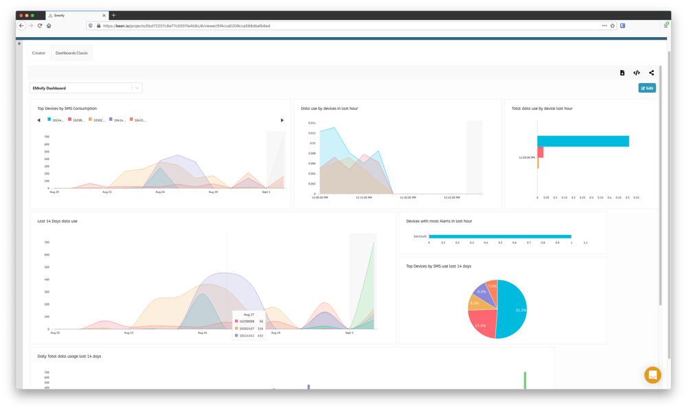
In this guide we will be building an example dashboard with several relevant widgets to troubleshoot connectivity. The following queries will be created and will have associated charts added to our dashboard:
- Top devices with highest data consumption in the last hour
- Top devices with highest number of warnings in the last hour
- Top devices by SMS consumption in last 14 days
- Total Data usage by device in the last hour (5 minute aggregates)
- Summary of data consumption in last 24 hours
- Chart of PDP create and delete events last hour
- Unique devices per RAT Type the last 14 days
- Unique devices per Network the last 14 days
Prerequisites
- A device with a cellular modem and EMnify SIM card
- A Keen.io account
Benefits
- data consumption integrated into operational dashboards for service teams
- allows faster triaging between device, connectivity and application issues
- view on service usage and cost per device
- directly delivered to Keen.io without need for managing an application server
Integration steps
- In your Keen.io account, create a new Project named EMnify
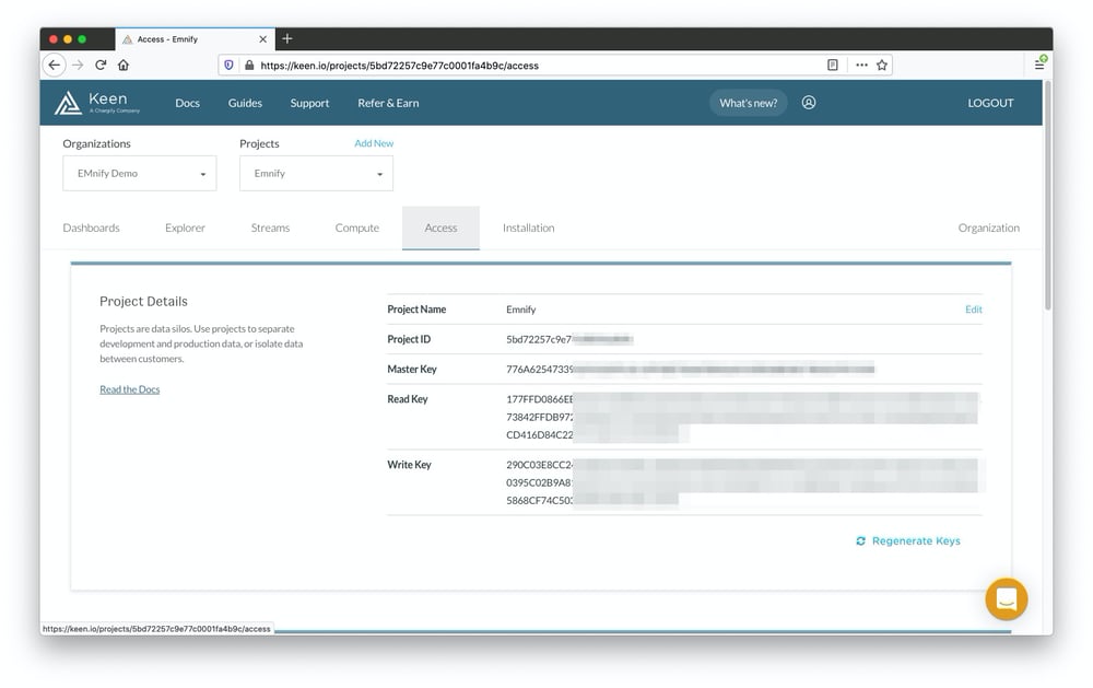
- In the EMnify project, navigate to Access, and make note of the Project ID and Write key
- Log in to the EMnify portal and navigate to the Integrations page to create, inspect and manage Data Streams
- Click Add New Data Stream and under Keen.io click ADD
- Select Stream both as the stream type
- Enter the Project ID and Write Key from step 2 into the relevant fields
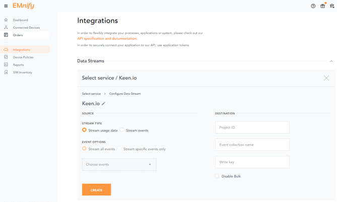
Newly-created data streams are immediately active and should show a green Running status indicating a 200 HTTP response code when correctly configured.
If the configuration is invalid, a warning message will be displayed indicating incorrect configuration.
Verifying the integration
To verify that the stream is bring processed correctly in Keen.io, navigate to Projects -> Streams. Two new streams called EMnifyEventData and EMnifyUsageData should be visible. To inspect recent events, click on one of the EMnify streams which will show recent events and the JSON content delivered: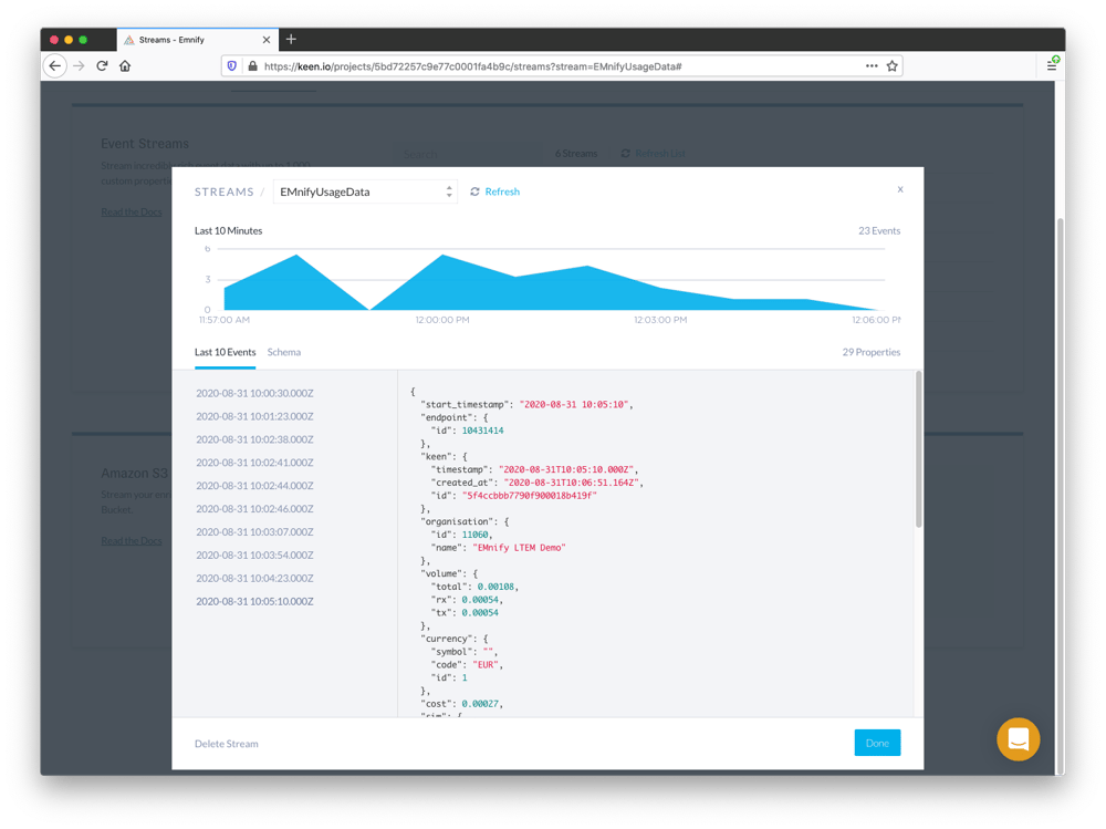
Creating Queries
Before being able to build dashboards, it's necessary to save queries that graphs will use as their data source. It's a good idea to create multiple queries as a first step which can later be graphed in various formats from bar graphs, pie charts, line graphs for time series insights and more. A core set of the most relevant queries for your fleet can then be individually cloned, customised and filtered to produce more focused or specified dashboards.
To create a query, navigate to Explorer and select Query - in our examples, we will be using Explorer V6 which is the latest version of the UI component for building graphing queries. The foundation of each query will be to choose an Event Collection (either EMnifyEventData or EMnifyUsageData) and the Analysis type which in our examples will use basic operations of count, count_unique and sum.
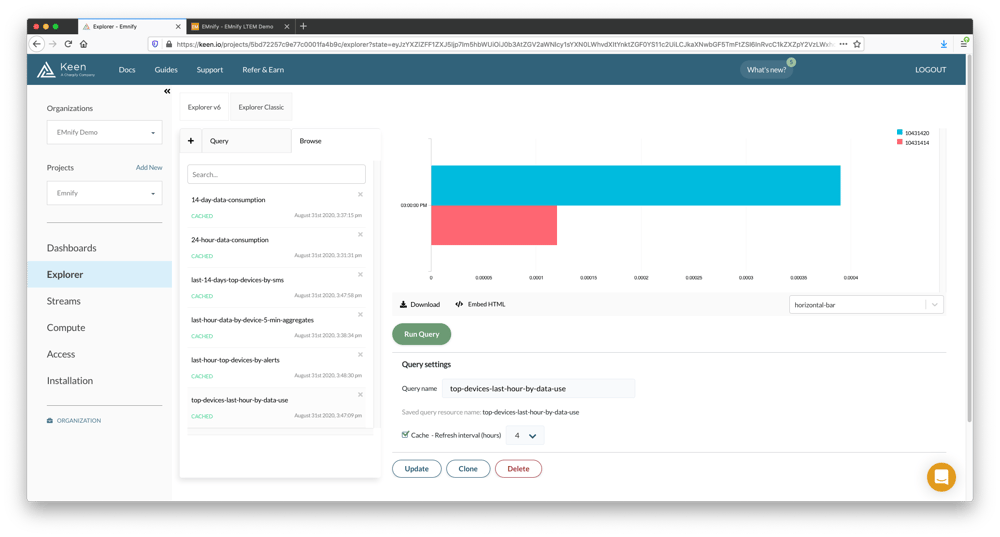
Top devices with highest data consumption in the last hour
Showing the top devices by data usage is a simple and effective way to identify devices which are using more data than expected. This can be especially helpful for troubleshooting misconfigured devices which may consume a large amount of data. To build this query:
- Navigate to Explorer and click the Query tab
- Set the Event Collection to EmnifyUsageData and the Analysis type to sum
- For Target property choose volume.total and set the Timeframe to Relative this 1 hours (the last 1 hours including the current day)
- Group by endpoint.id, order by DESC and set the interval to hourly
Top devices with highest number of warnings in the last hour
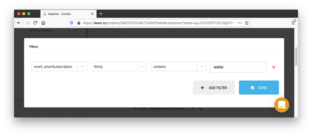
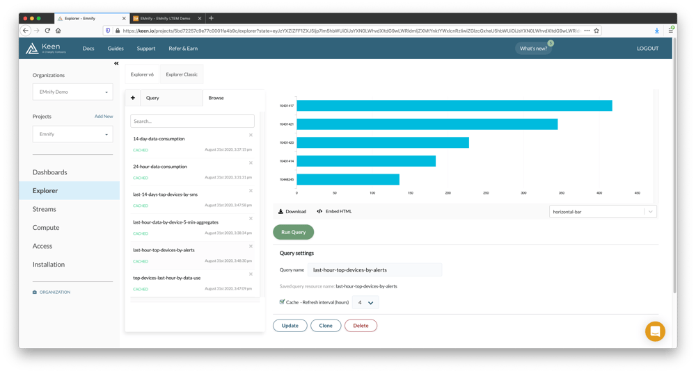
For this query, we will be interested in looking at warning events. This is achieved in Keen.io with the use of the filtering function by the severity of the event which is delivered by the EMnify platform in the event_severity JSON object.
- Set the Event Collection to EmnifyEventData and the Analysis type to count
- Set the Timeframe to Relative this 1 hours (the last 1 hours including the current day)
- Add a Filter where the event_severity.description of type String contains WARN
- Group by endpoint.id, order by DESC and set the interval to hourly
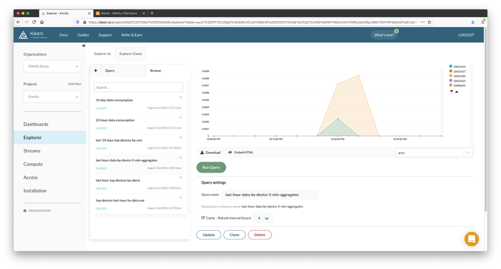
Data usage by device in the last hour (1 or 5 minute aggregate)
- Set the Event Collection to EmnifyUsageData, the Analysis type to sum and the Target property of volume.total
- Set the Timeframe to Relative this 1 hours (the last 1 hours including the current day)
- Group by endpoint.id, order by DESC and set the interval to 5 minutes
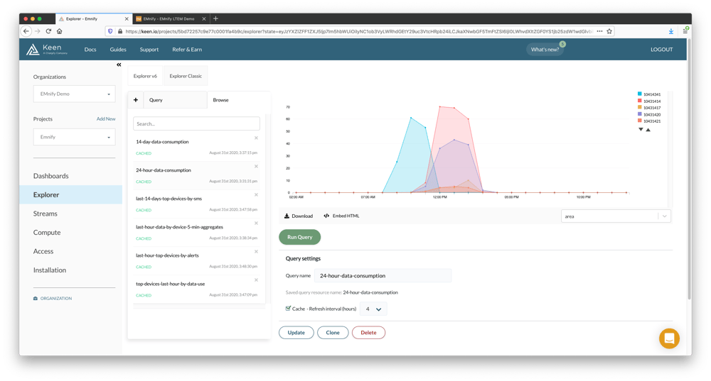
Data consumption per hour over last 24 hours
- Set the Event Collection to EmnifyUsageData, the Analysis type to sum and the Target property of volume.total
- Set the Timeframe to Relative this 1 days (the last 1 days including the current day)
- Group by endpoint.id, order by DESC and set the interval to 1 hours
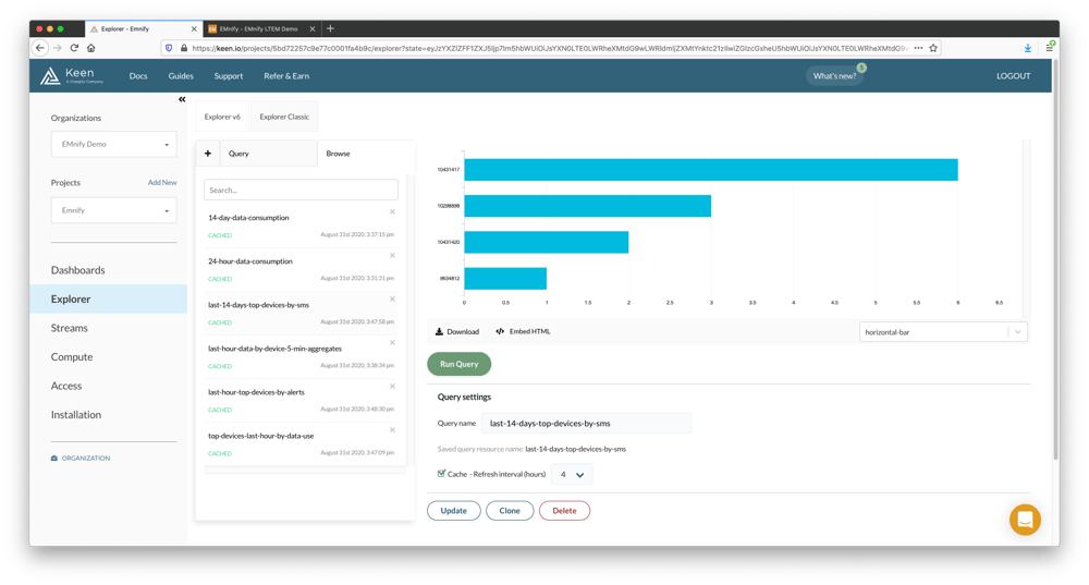
Top devices by SMS consumption in last 14 days
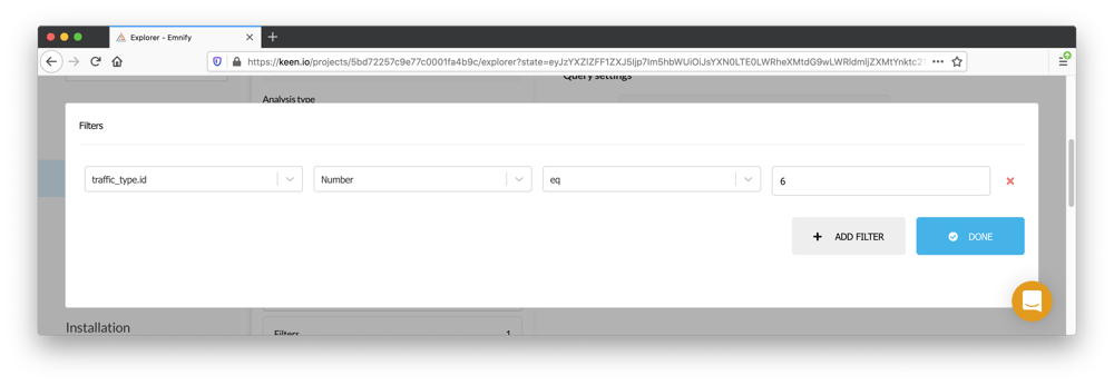
For this query, we will be interested in looking at usage data with SMS as the traffic type. This is achieved in Keen.io with the use of the filtering function by the traffic_type delivered by the EMnify platform and using traffic type with an ID of 6 for SMS.
- Set the Event Collection to EmnifyUsageData, the Analysis type to count
- Set the Timeframe to Relative this 14 days (the last 14 days including the current day)
- Add a Filter where the traffic_type.id of type Number equals 6
- Group by endpoint.id, order by DESC and omit an interval
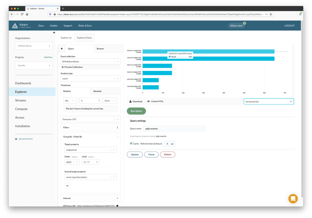
PDP create and delete events
To create a chart that graphs PDP context creation and deletion events;
- Set the Event Collection to EmnifyEventData, the Analysis type to count
- Set the Timeframe to Relative this 1 hours (the last 1 hour including the current day)
- Add a Filter where the event_type.description of type String contains PDP
- Group by endpoint.id DESC, order by event_type.description and select horizontal-bar as the chart type
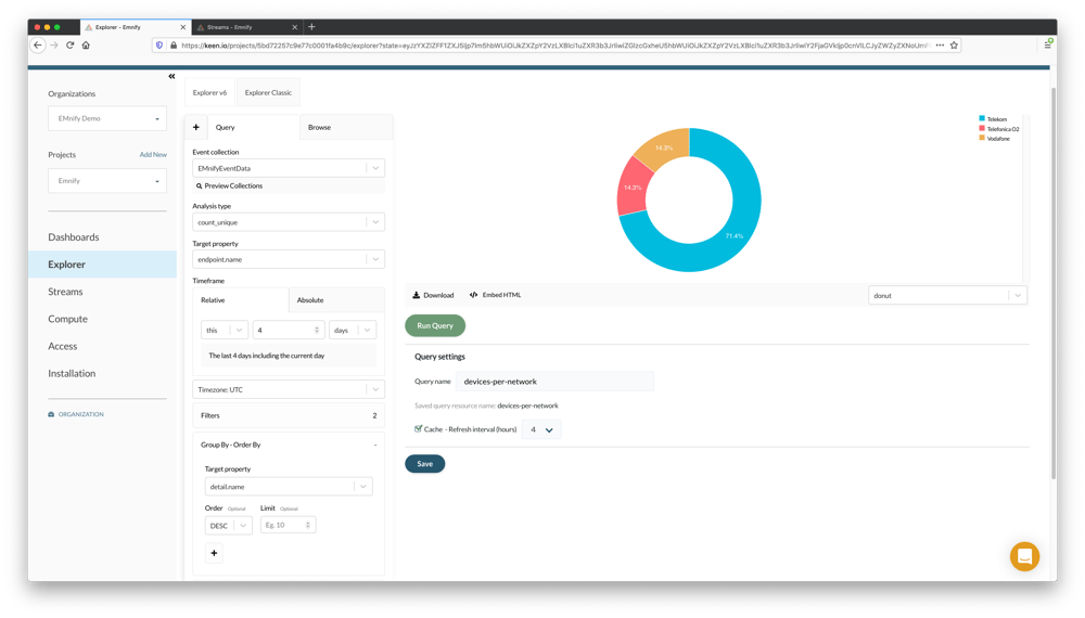
Count of unique devices per network
The following graph will allow for a count of unique devices per network over the previous four days. To build this query;
- Set the Event Collection to EmnifyEventData, the Analysis type to count_unique and a Target property of endpoint.name or endpoint.id
- Set the Timeframe to Relative this 4 days (the last 4 days including the current day)
- Add a filter for event_type.description of type String equals Create PDP Context
- Add a second filter where the detail.name of type String not_contains null

- Group by detail.name and select donut as the chart type
Unique devices per RAT Type in last 2 weeks
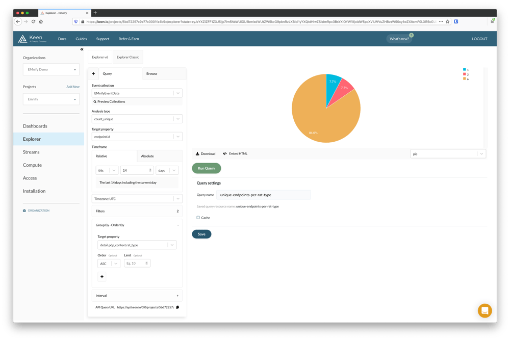
The following pie chart will allow for a count of unique devices per radio access technology over the previous two weeks. In this way we can achieve an overview of which types of radio technologies have been used at least once by any given device. To build this query;
- Set the Event Collection to EmnifyEventData, the Analysis type to count_unique and a Target property of endpoint.name or endpoint.id
- Set the Timeframe to Relative this 14 days (the last 14 days including the current day)
- Add a filter for event_type.description of type String equals Create PDP Context
- Add a second filter where the detail.name of type String not_contains null
- Group by detail.pdp_context.rat_type and select pie as the chart type
The RAT Type IDs reported are
- 1 - 3G
- 2 - 2G
- 6 - 4G
Building the Dashboard
After at least one query has successfully been saved, it's possible to include it in a dashboard. To create a dashboard, navigate to Dashboards and give it the name Emnify Dashboard
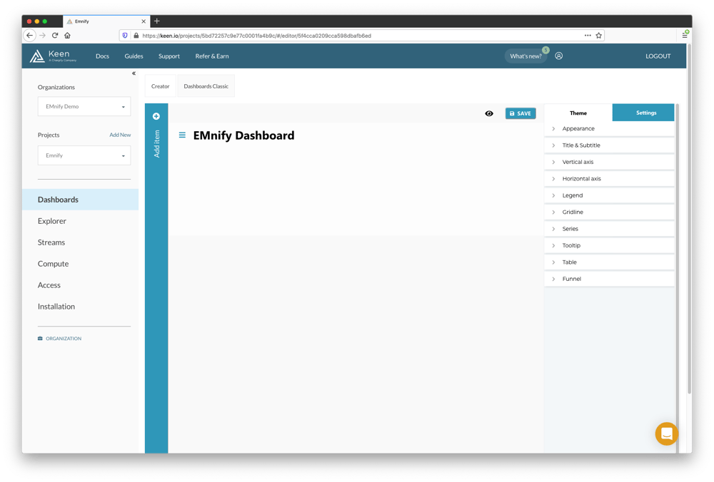
- Click + Add Item and select Line Chart. A new chart will be created with placeholder data.
- Hover the mouse over the graph to display a context menu and click the Settings cog icon
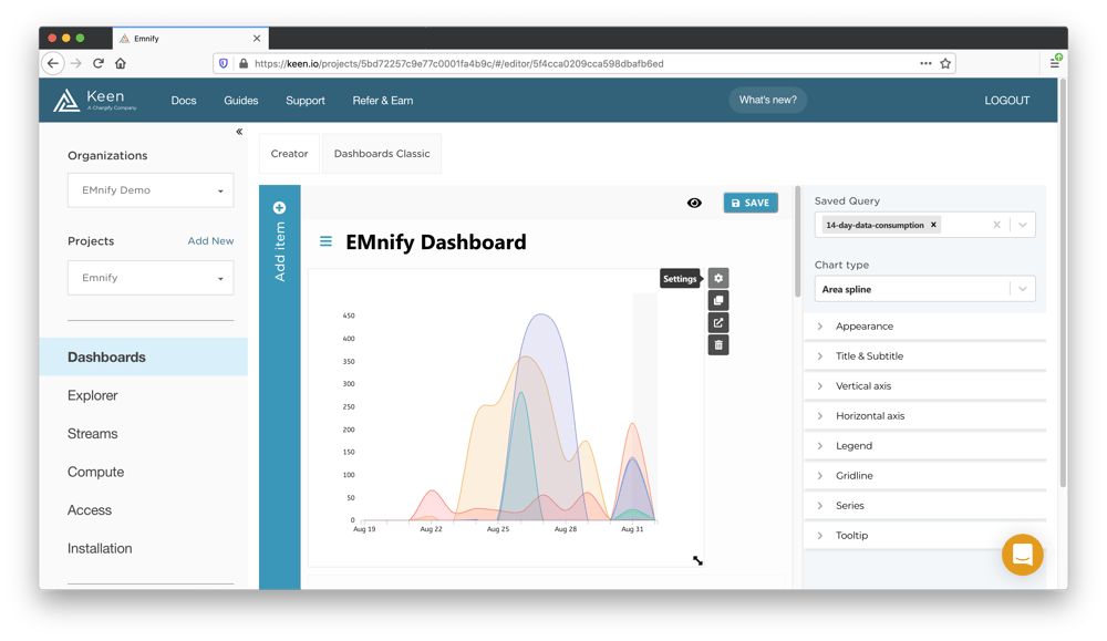
- Pick a query from the saved queries. This example uses the 14-day-data-consumption query
- Select a chart type. The Area or Area Spline type are good choices for wide graphs which show data consmumption over a time series.
- Click Title and add the title "Last 14 days data consumption by device" and click save
- Repeat steps to add a chart per query, giving an appropriate title for chart to match the query name
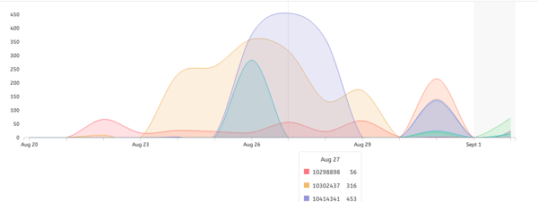
When each query has an associated chart, click the eye icon to preview the dashboard. When the preview is active, the charts can be interacted with on mouse hover and the associated endpoint IDs are visible for inspecting peaks or time periods. A tooltip displays a breakdown of represented values for the chart with the endpoint IDs displayed:
Next Steps - Embedded Analytics
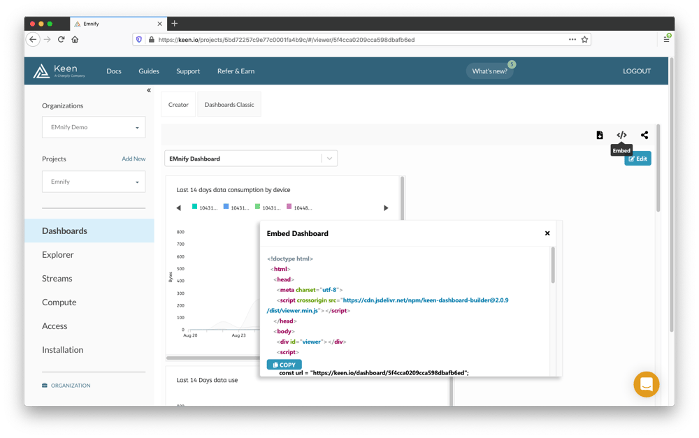
In this guide, we have learned how to create simple dashboards which provide actionable insights into the data consumption, SMS and network activity of your devices. With each dashboard that is created, the dashboard or individual charts can be embedded into separate web pages. This is relevant for inclusion in existing operational dashboards for cross-referencing application troubleshooting with device network information. More details on creating detailed queries for embedded dashboards can be found on the Keen.io documentation for Embedded Analytics.

The content team of emnify is specialized in all things IoT. Feel free to reach out to us if you have any question.
