Stream connectivity metadata and build reports for monitoring your device activity in real-time
The EMnify DataStreamer makes connectivity data available in your Azure account for real-time insights on the consumption and state of your devices. This guide describes the steps to build a report in Power BI. The steps covered are building a basic Stream Analytics job, delivering selected metrics to Power BI, building reports and customising data visualizations to assist in troubleshooting device connectivity.
This guide will cover how to build charts which display the following information:
- Data consumption by device
- SMS consumption by device
- Count of unique devices per network operator
- Count of total events by Endpoint ID (general overview of device activity)
- Total data consumption by device as timeseries
- List of devices with warnings with root cause
- Count of Warning Events per Endpoint
- PDP Create and Delete Events
Prerequisites
- A device with a cellular modem and EMnify SIM card
- An Azure Event Hub with events incoming from the EMnify platform
- A Microsoft Office subscription with access to https://app.powerbi.com
Benefits
- Faster triaging between device, connectivity and application issues
- View on service usage and cost per device
- Delivered to PoweBI through a Stream Analytics job with the option of using basic queries, aggregates and anomaly detection functions
Stream Analytics Job
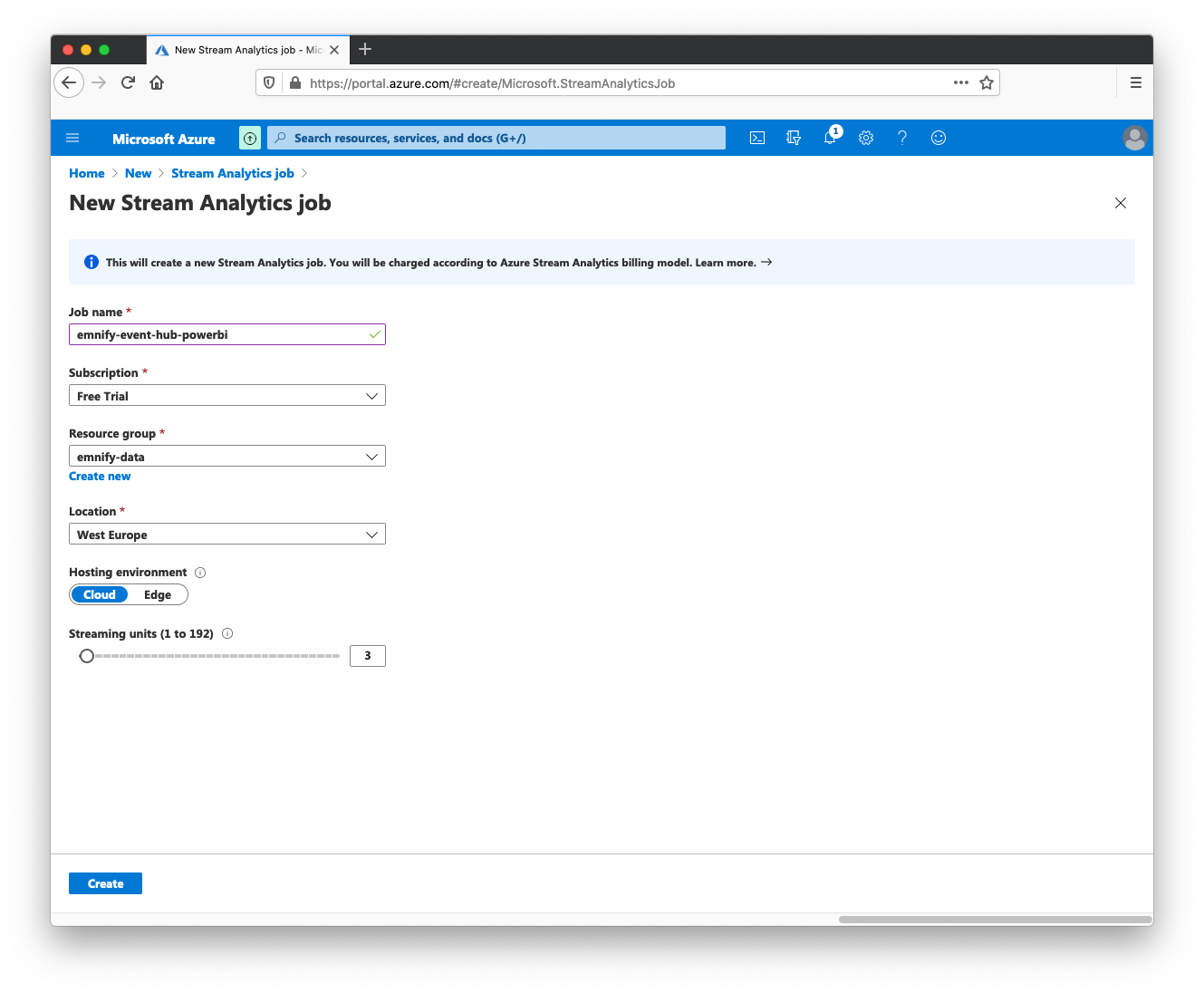
To be able to stream data to Power BI, a simple Stream Analytics job can set up to collect basic fields that we're interested in and stream them in real-time to Power BI. To create a Stream Analytics job:
- Navigate to https://portal.azure.com/#home and click + Create Resource
- Search for Stream Analytics Job, and click Create
- Give the job the name emnify-event-hub-powerbi, select the resource group of the existing event hub
- Select a subscription, a region closest to your geographic location and click create
When the deployment of the resource is complete, click view resource to view the stream analytics job. The next steps will set the data incoming to Event Hub to be the input and Power BI as the output for a basic analytics job. In the Stream Analytics job;
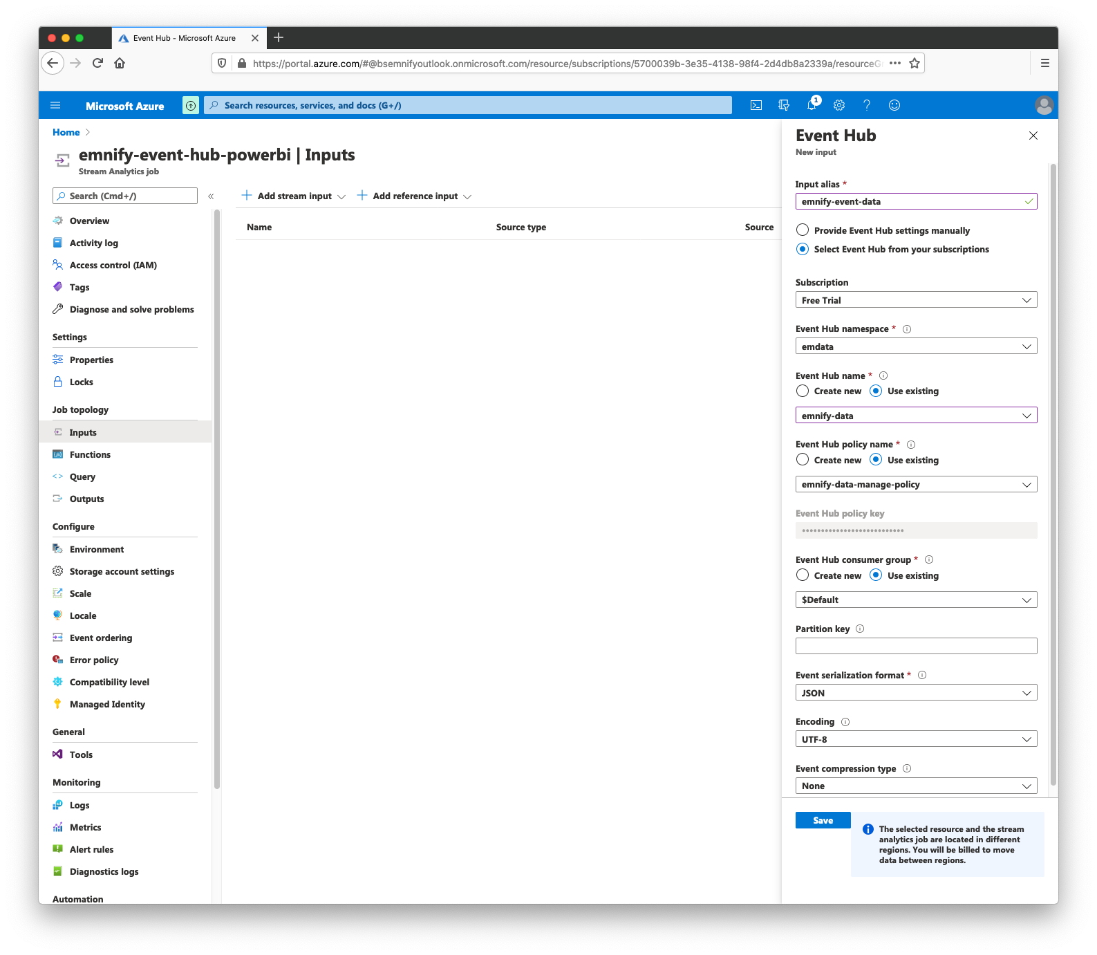
- Navigate to Inputs, select + Add Stream Input and select Event Hub as the input type
- Give the input an alias, this example will use emnify-event-data
- For Event Hub Name select the existing event hub
- For Event Hub Policy select a policy with read permissions for the event hub
- For Consumer Group, select the $Default group and click Save
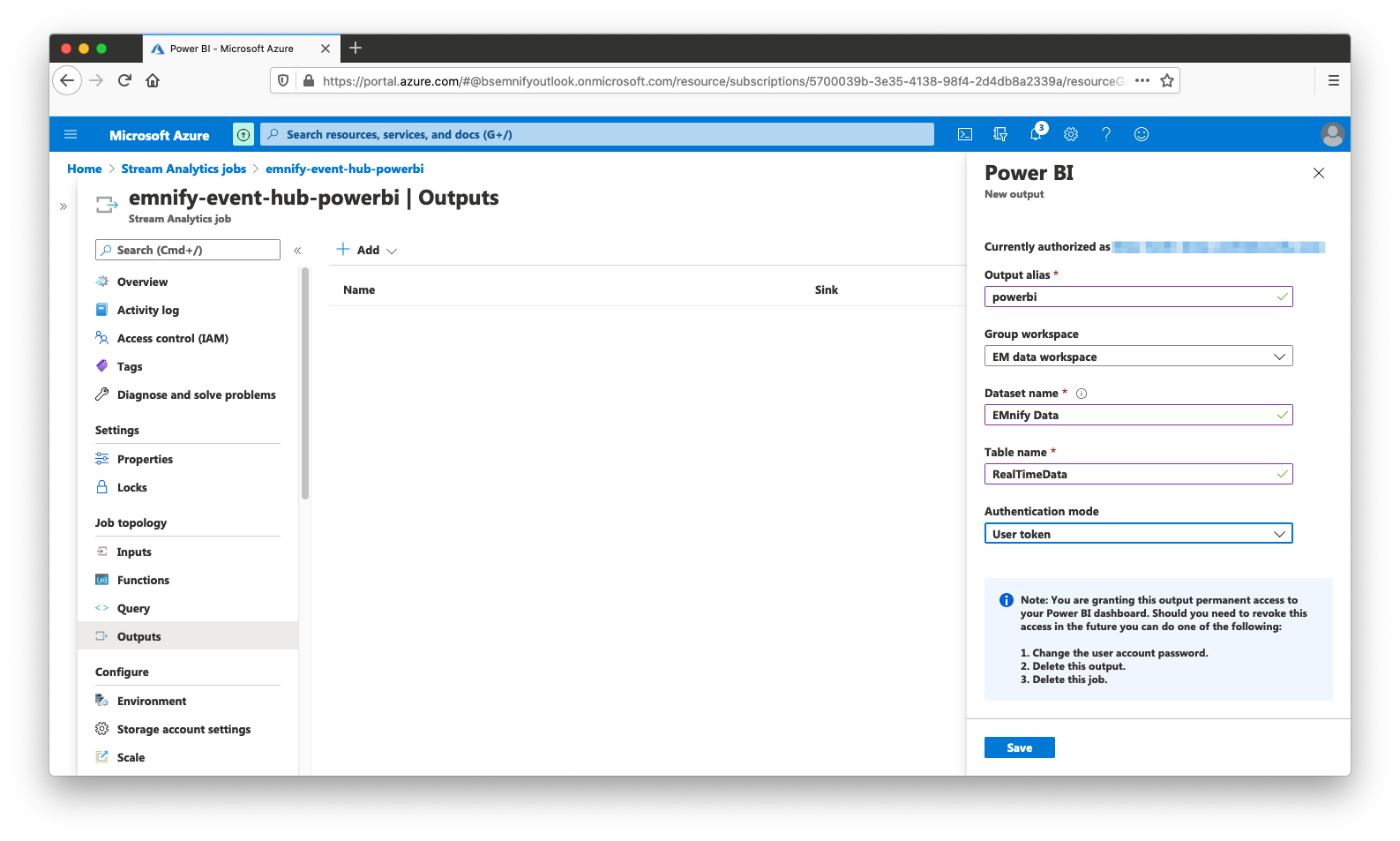
- Navigate to Outputs and click + Add and select PowerBI
- Click Authorize to allow Azure write access to your Power BI workspace
- When authorized, set the output alias to powerbi
- Select the workspace to send data to and give the dataset the name EMnify Data and select a table name such as RealTimeData
- Set the authentication mode to use User Token and click Save
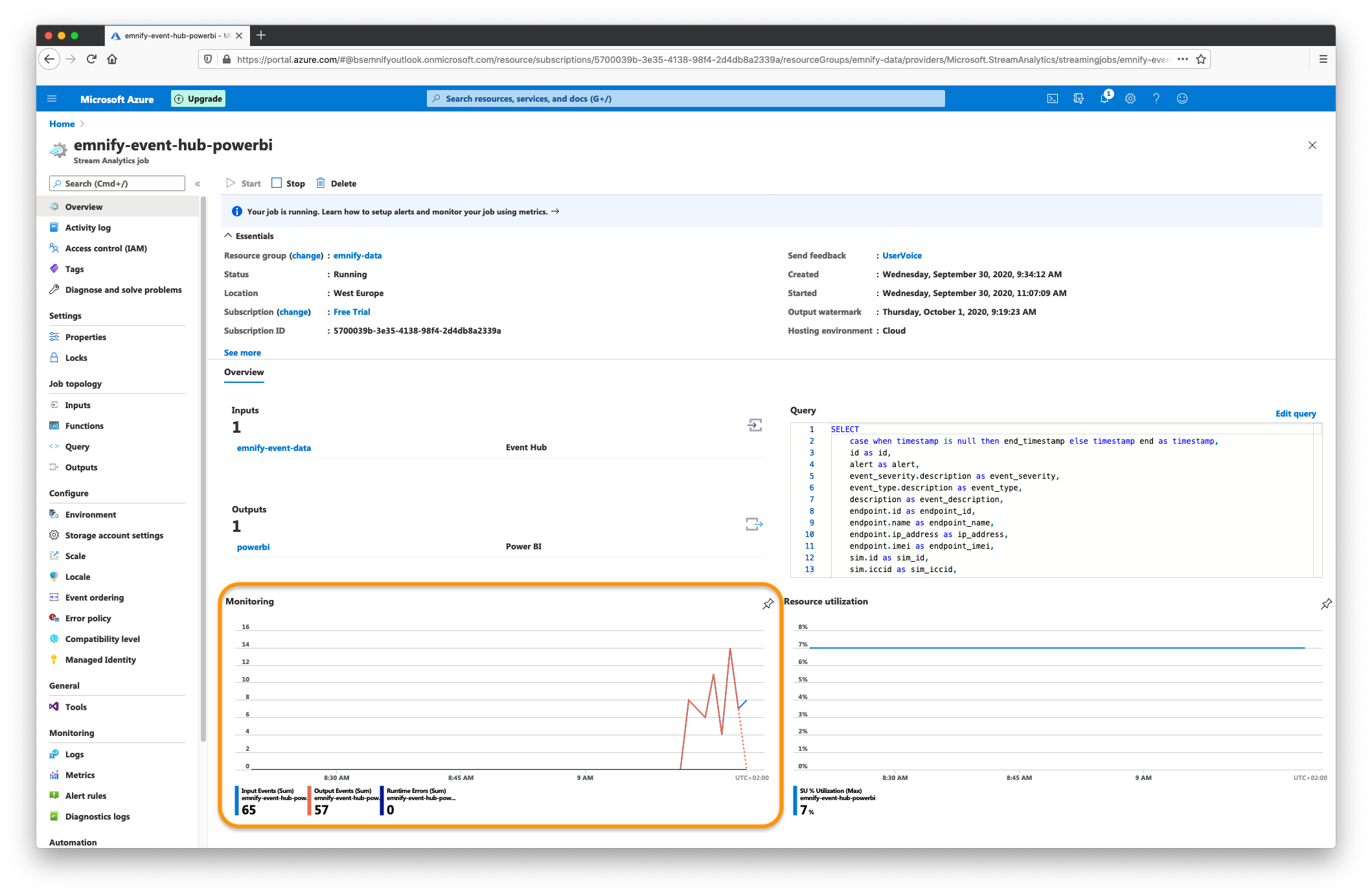
The last step for a basic analytics job is to select fields from the Event Hub that we can build reports from. In this case we are selecting from some nested JSON elements and flattening them into fields that have short, meaningful names. To build a basic query, navigate to Query and paste the following SQL query that the job will run continuously:
SELECT
    case when timestamp is null then CAST(end_timestamp AS DATETIME) else CAST(timestamp AS DATETIME) end as timestamp,
    id,
    event_severity.description as event_severity,
    event_type.description as event_type,
    description as event_description,
    endpoint.id as endpoint_id,
    endpoint.name as endpoint_name,
    endpoint.ip_address as ip_address,
    endpoint.imei as endpoint_imei,
    sim.id as sim_id,
    sim.iccid as sim_iccid,
    imsi.imsi as imsi_imsi,
    detail.country.name as country_name,
    detail.name as operator,
    traffic_type.description as traffic_type,
    CAST(alert as bit) as alert,
    CAST(volume.rx AS FLOAT) as volume_rx,
    CAST(volume.tx AS FLOAT) as volume_tx,
    CAST(volume.total AS FLOAT) as volume_total
INTO
    [powerbi]
FROM
    [emnify-event-data]
To begin the Stream Analytics job, click Save Query, navigate to Overview and click Start Job. This query will now select events that are of interest as they arrive in our Event Hub and stream them in real-time to the Power BI workspace.
Verifying the Integration
The Overview panel of the stream analytics job should show a status of Running and the Monitoring graphs should display successful events incoming and outgoing.
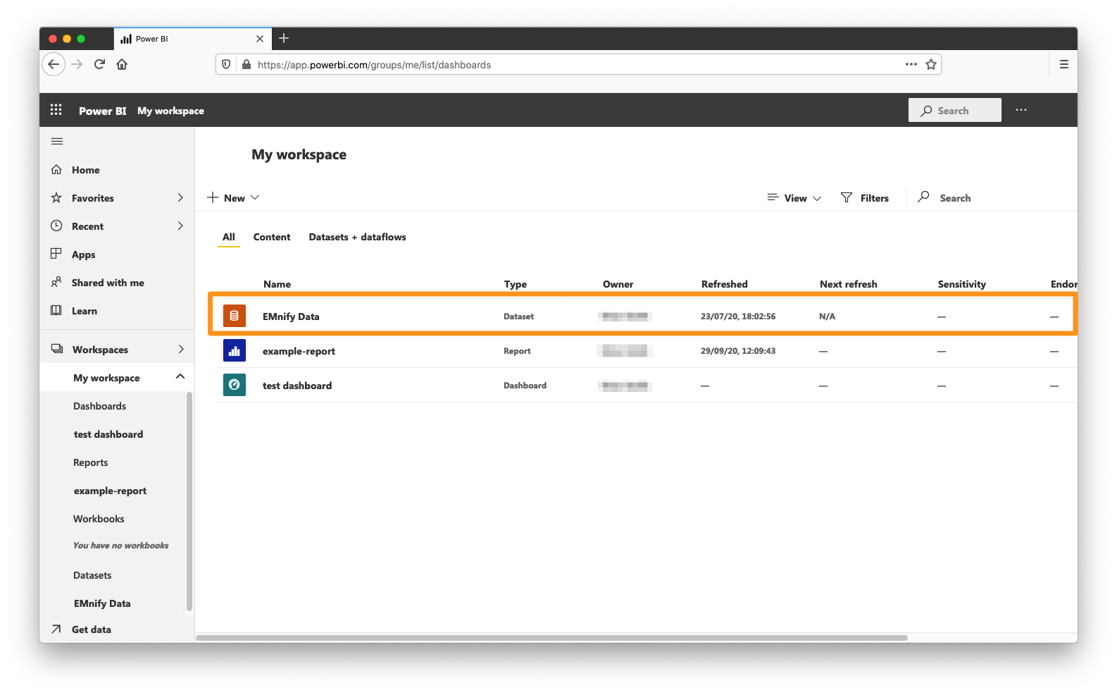
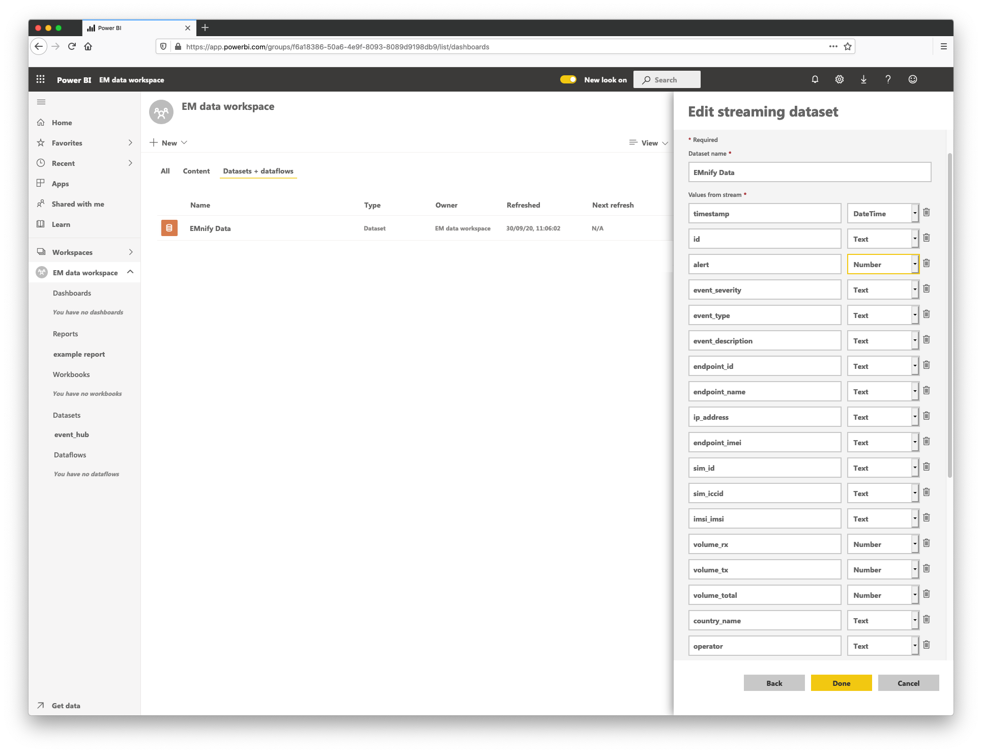
In Power BI the dataset should be visible by navigating to https://app.powerbi.com/groups/me/list/dashboards, specifically in the Datasets + dataflows tab
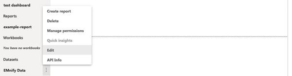
The fields in the dataset can be inspected by selecting the dataset context menu and clicking Edit
For the examples in this guide to work, ensure that the following fields have the correct types:
- timestamp must be of type DateTime
- volume_rx, volume_tx and volume_total must be of type number
- alert must be of type Number
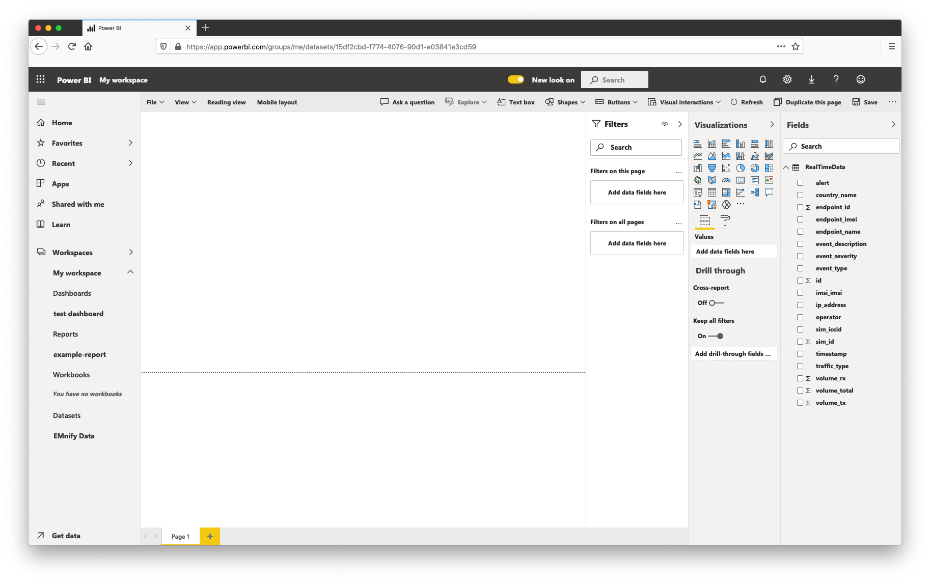
Creating a Report
- In the Power BI workspace, click + New and select Report.
- Select the dataset EMnify Data and click create
In this view, reports can be created by selecting metrics from the Fields panel on the right and graphing them using one of the available visualization tools. Filtering can be applied based on example events that are streamed, which will allow for narrowing visualizations to events that are of interest or applying a global timeframe to the queries by means of a filter of timestamp by relative time.
Hint: filters can be applied in the following three ways:
- on a specific visualization
- on all visualizations on a page
- on all visualizations on all pages
This allows for making reports which are filtered by timeframe, by operator, or by device group using tags. For our case, it's useful to build pages (or entire reports) which are filtered to show events from the last 24 hours or the last hour. The necessary steps to filter by time range across multiple charts is detailed in a later step.
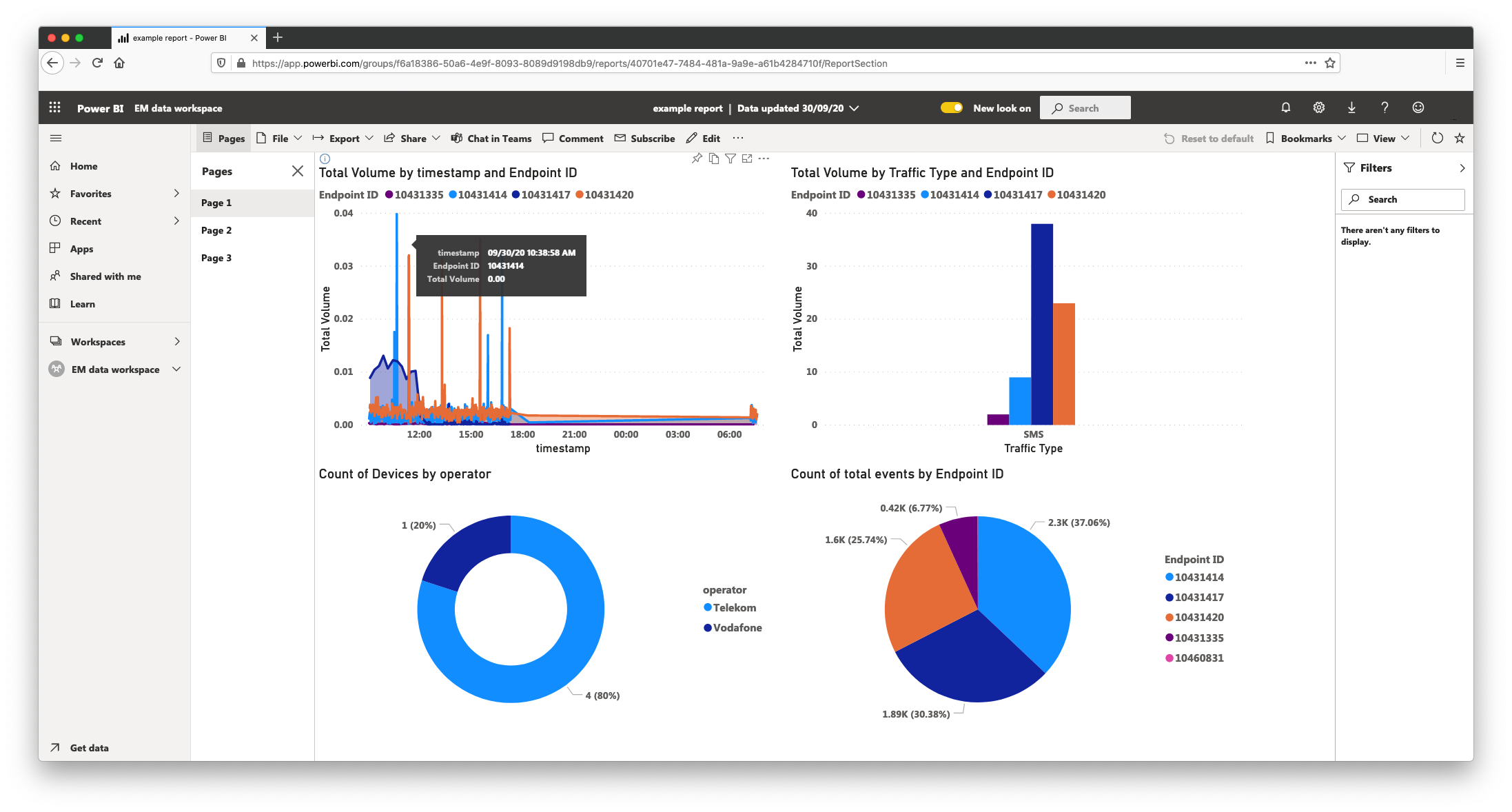
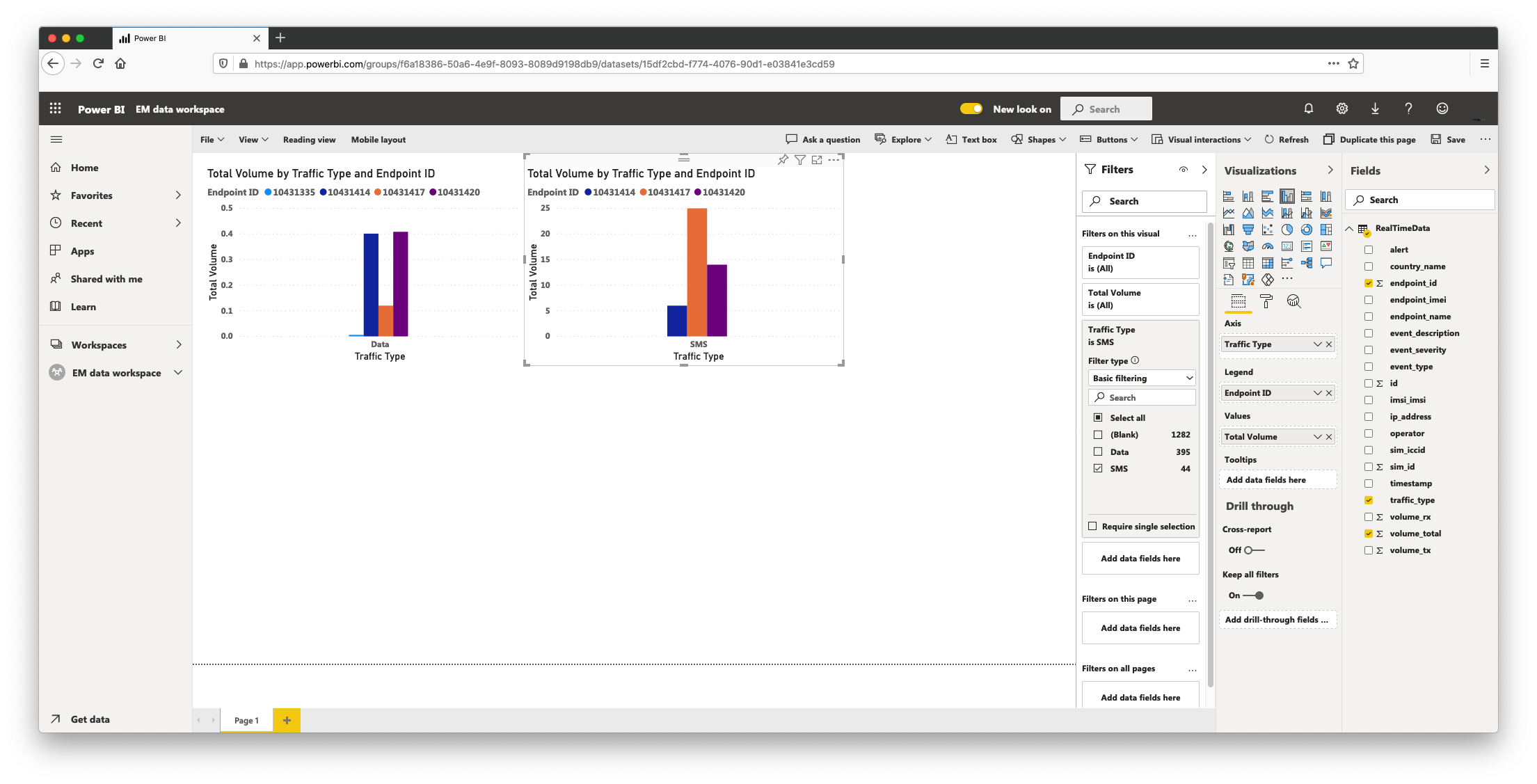
Data Consumption By Device
In the new report:
- Click Clustered column chart from the visualization type
- For the Legend of the visualization, click and drag the field endpoint_id
- Click and drag volume_total from the Fields tab to Values
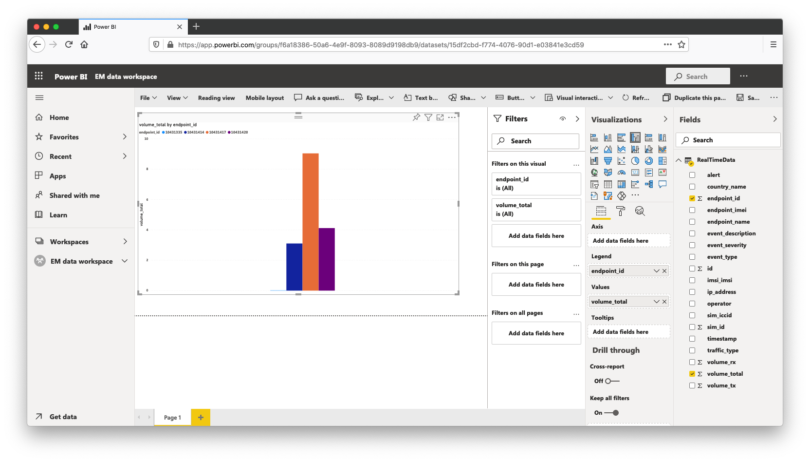
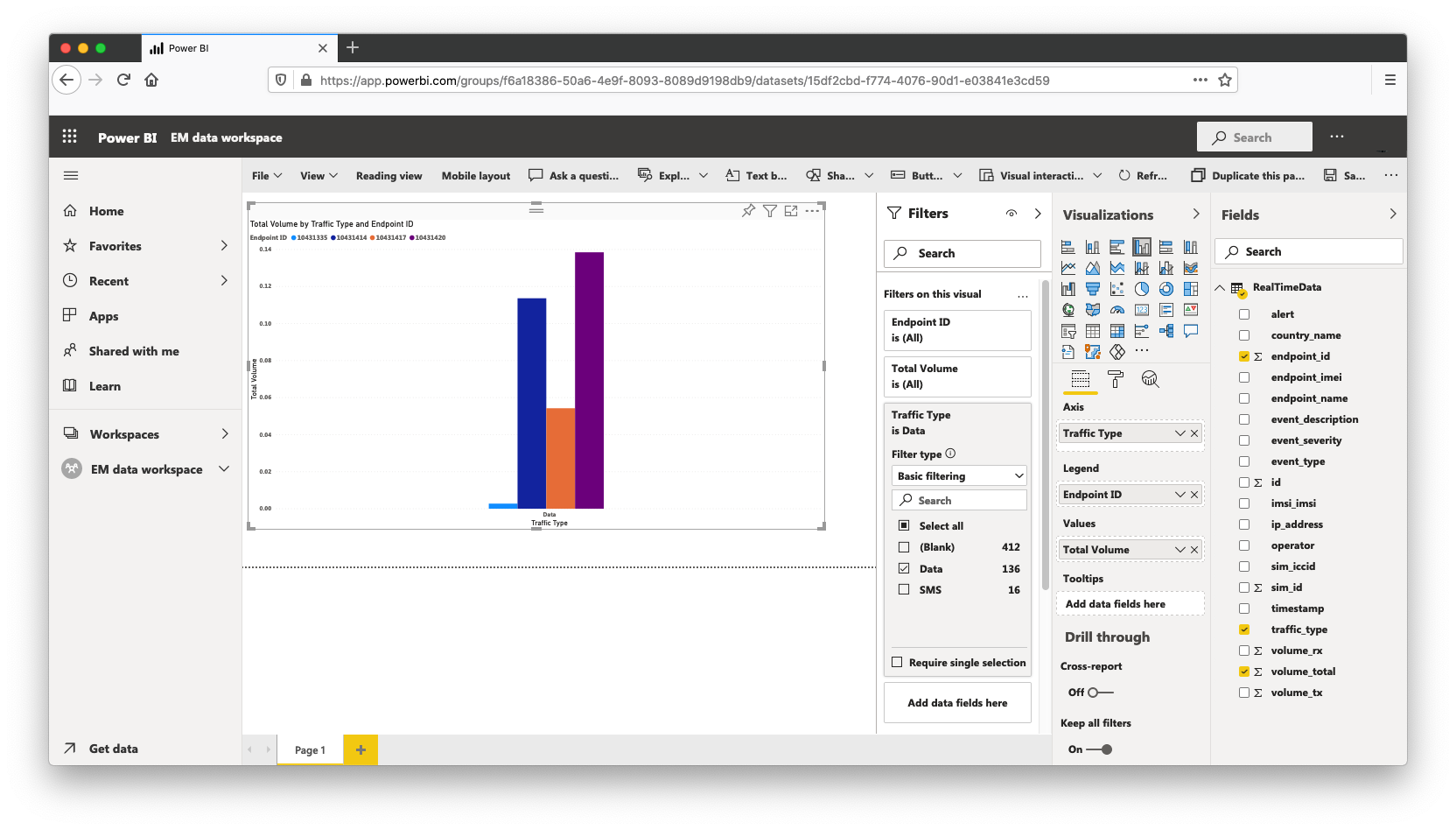
This chart now displays total volume of both Data and SMS traffic by endpoint ID. Some improvements can be made to give the chart more readable names and to be accurate in the type of traffic consumption. To filter by traffic type: - click and drag traffic_type over to the Axis input in the visualization
- in the Filters tab, expand traffic type and select only Data
The process of Renaming the graphed values is described once for this chart and the same process can be repeated in the whole report. To rename values: - right-click traffic_type under Axis, click rename and give it the name Traffic Type
- right-click endpoint_id under Legend, click rename and give it the name Endpoint ID
- right-click volume_total under Values, click rename and give it the name Total Volume
This chart now displays Data consumption in MB by device for the whole dataset.
SMS consumption
An accelerator for creating these visualizations is to copy existing charts and adjust the filtering criteria. To create a corresponding SMS consumption chart:
- select the existing graph and use the keyboard shortcuts for copy & paste
- in the duplicated chart, expand the Traffic Type filter and select SMS
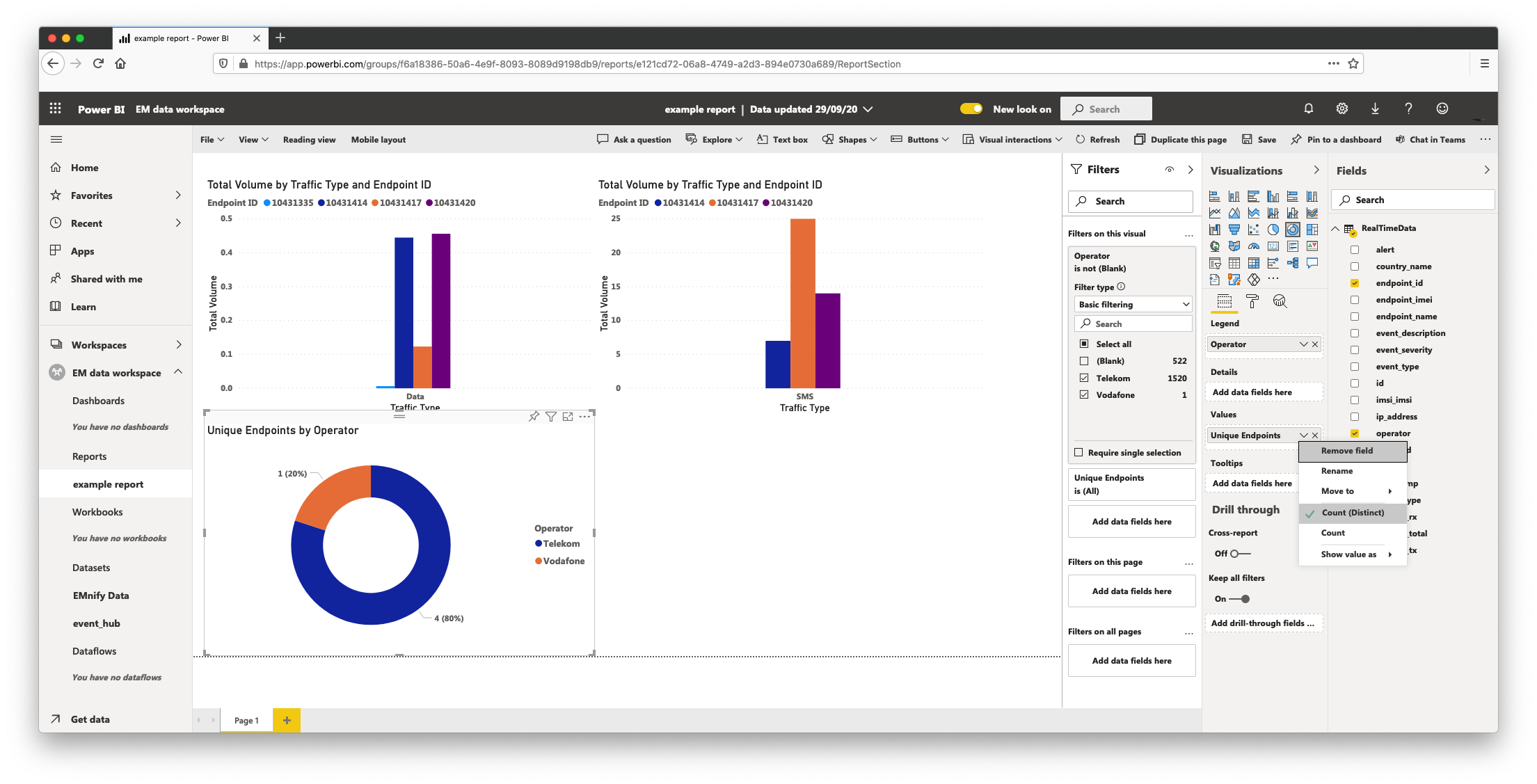
Count of unique devices per Operator
To create a quick count of devices per operator;
- click a blank area on the page to deselect any existing charts
- click donut chart visualization and drag operator to Legend input of the visualization panel
- drag endpoint_id to the Values input of the visualization panel
- click the down-arrow symbol on endpoint_id under Values, select Count (distinct) and rename the field to Unique Endpoints
- Expand the operator filter in the Filters panel, select all and then deselect (blank) to ensure only events with an operator name are displayed
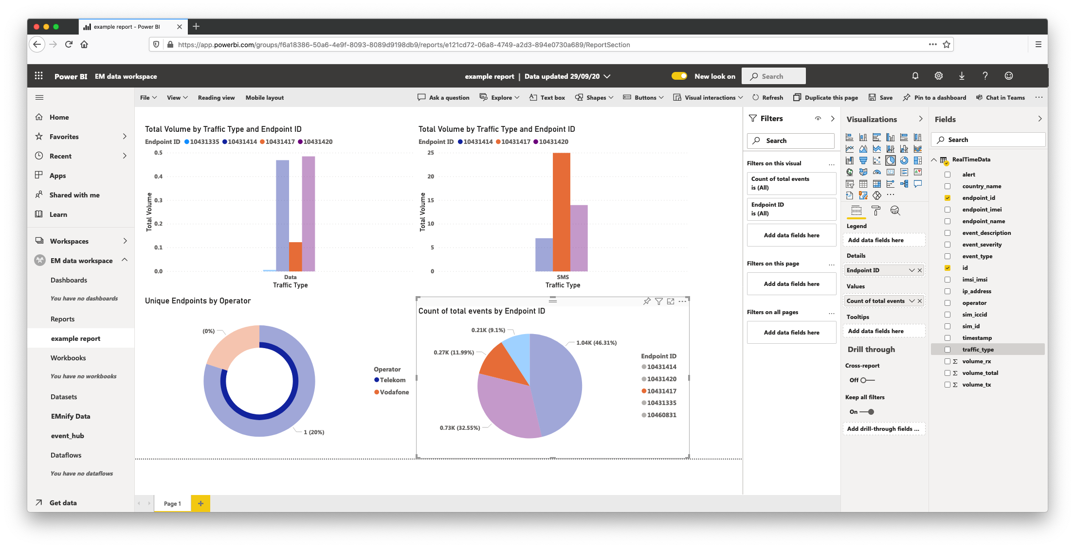
Count of total events by Endpoint ID
As our example data stream uses both event and usage data, this chart covers both usage data and event data and is a quick indicator of the general activity of devices showing the most active by endpoint ID.
- click on an empty section in the page and click Pie Chart from the Vizualisations panel
- drag id over to the Values input and rename it to Count of total events
- drag endpoint_id over to the Details input and rename it Endpoint ID
Filtering Pages by Time Range
At this point, our first page is complete which covers a general overview of device fleet activity. To improve this view to offer more context, add a time range filter.
- drag the timestamp field over to the filters panel where it says Filters on this page
- set the filter type to Relative Time and show items when in the last 1 hours
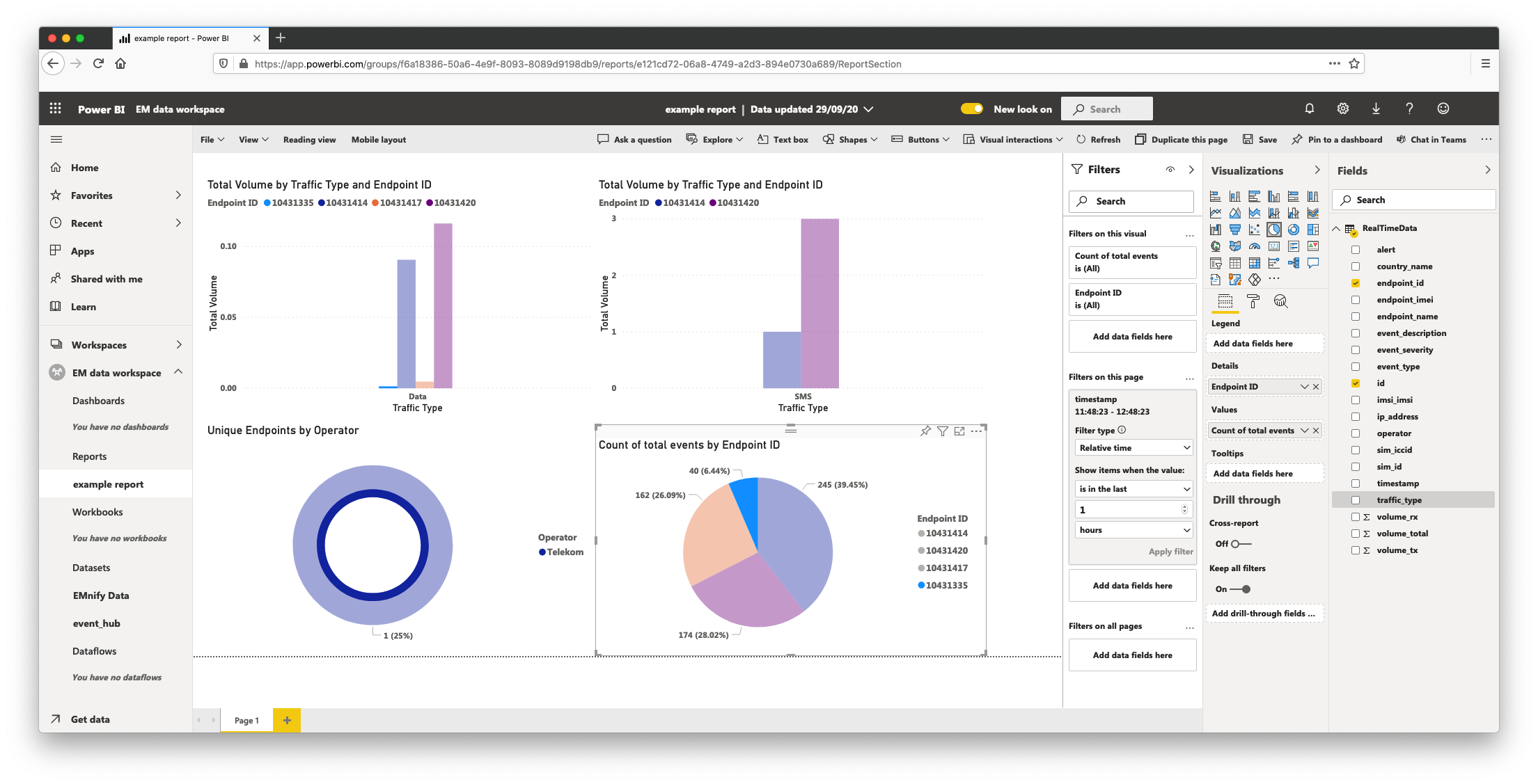
All visualizations are now only showing queries of device activity within the last time range. To perform a basic drill-down, click one of the segments in the pie chart to single-out a specific device by ID, this will apply the same display filtering on all charts to highlight the activity of that device relative to data consumption, operator and SMS usage.
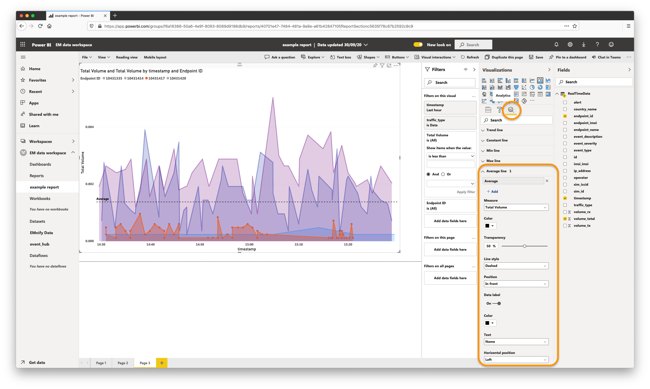
Total Volume by device as Time Series
It's often useful to view the data consumption of devices as a time series to visualize device activity trends. To achieve this
- select area chart with timestamp as the Axis, Endpoint ID as the Legend and Total Volume as the Values
- create a filter where the traffic type is Data
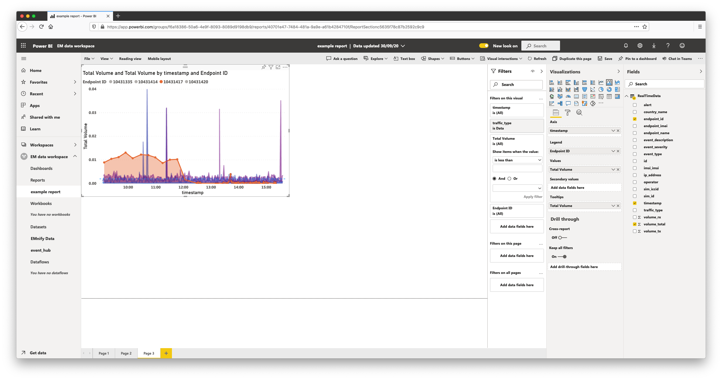
The features built-in to Power BI that make charts more effective at conveying the story behind the metrics are included in the Analytics tab of the Visualizations panel. For graphs such as data consumption, it's often useful to enable a trend line or a line which shows average values:
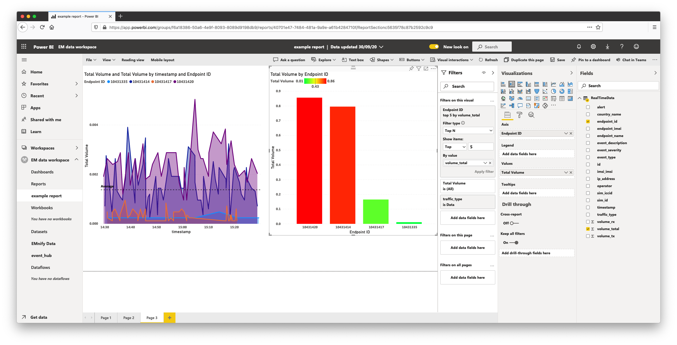
Top 5 devices by data consumption
The following graph sets a filter by top N devices by any metric, this example will use total data consumption.
- choose stacked column chart from the Visualizations type
- drag endpoint_id over to the Axis input and rename it to Endpoint ID
- drag volume_total over to the Values input and rename it to Total Volume
- in the Filters panel, expand endpoint id and select Top N as the Filter Type and set it to Top 5
To set conditional formatting based on expected values, select the Format panel under Visualizations and choose the formula icon in Data Colors. Min/max values can be visually differentiated or custom values can be specified which make graphs easier to read if values exceed expected thresholds:
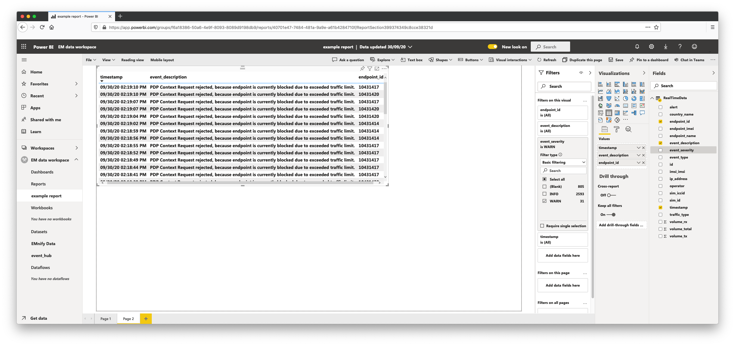
Devices with warnings and event details
Create a specific troubleshooting page with a table displaying the latest network alerts:
- click the + plus symbol at the bottom to create a new page
- in the Visualizations tab, select Table
- drag timestamp, event_description and endpoint_id over to the values input
- drag event_severity over to the Filters tab, expand it and select only WARN events
Clicking on the timestamp column header will sort the table events by timestamp from earliest or latest in the dataset.
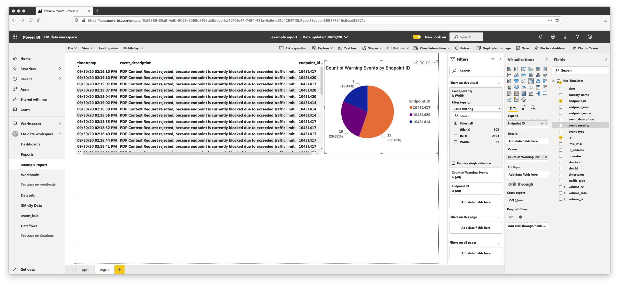
Count of Warning Events per Endpoint
This chart shows the distribution of Warning Events by endpoint, to create this chart:
- click a blank area on the page and select Pie chart
- drag event_severity over to the Filters tab and select only WARN type events
- drag endpoint_id to the Legend input of the Visualization and rename it to Endpoint ID
- drag id over to the Values input of the Visualizations tab and rename it to Count of Warning Events
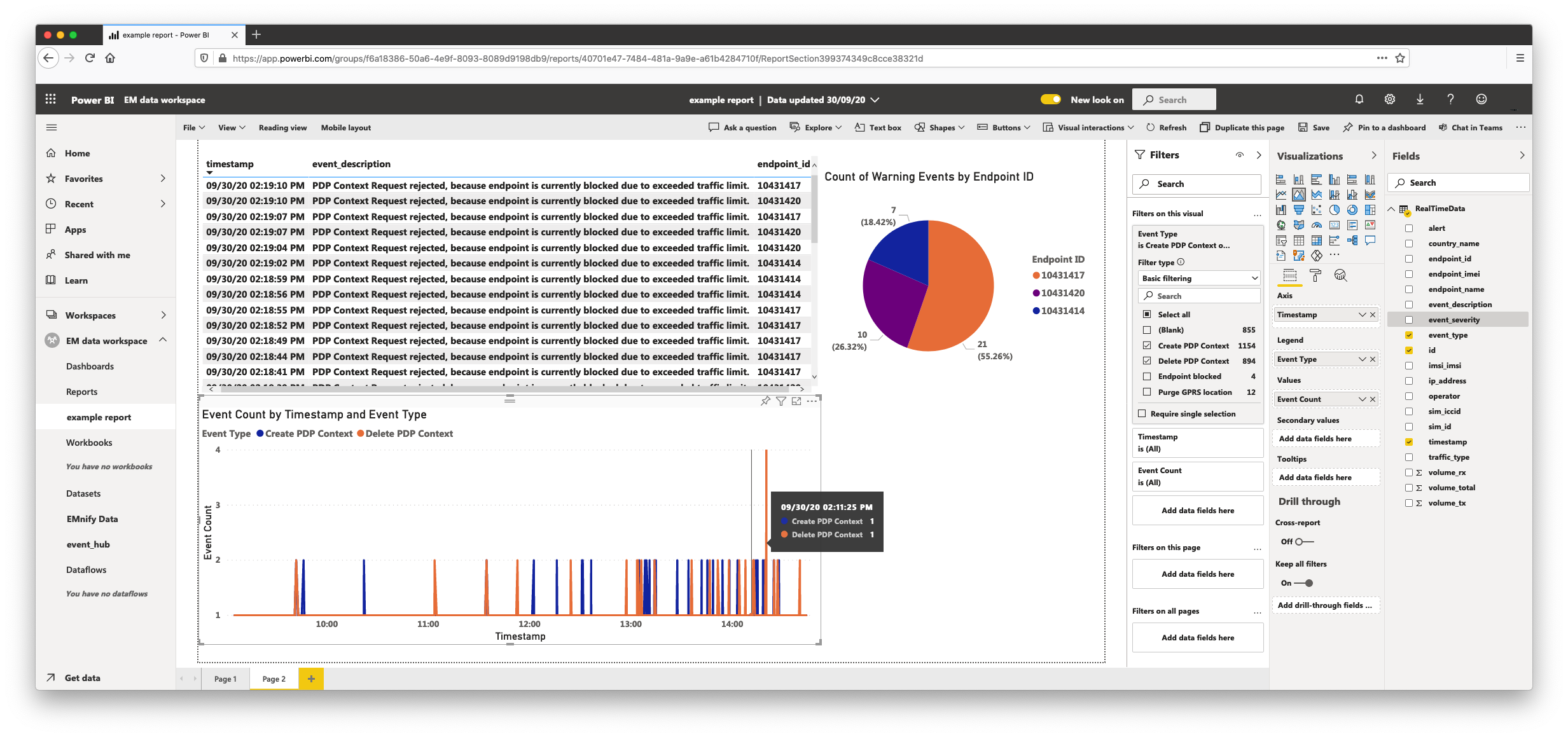
PDP Create and Delete Events
Graphing PDP create and Delete events over time can be an additional method of troubleshooting device network activity, to build this graph:
- select the Area chart Visualization
- for Axis, drag the timestamp value across and rename it to Timestamp
- for Legend, drag the event_type field, rename it to Event Type and set the filter value to Create PDP Context and Delete PDP Context
- for Values, drag the id property and rename it to Event Count
Acting on data based on Warnings
To make the graphs actionable, the second page focuses on warnings. The data that each graph is built upon can then be exported as either CSV or Excel files.
- click on the more options icon (three horizontal dots) in the top-right corner of a graph
- click Export Data and select either summarized data (graphed data) or underlying data which contains raw events from the dataset
Note that filters applied to a page enable exporting only events which are of interest, if a time range filter is applied to a page, only warning events from that time range will be exported. The generated reports which filtered to last hour, for example, can assist in operations teams for troubleshooting underlying issues which are time-critical: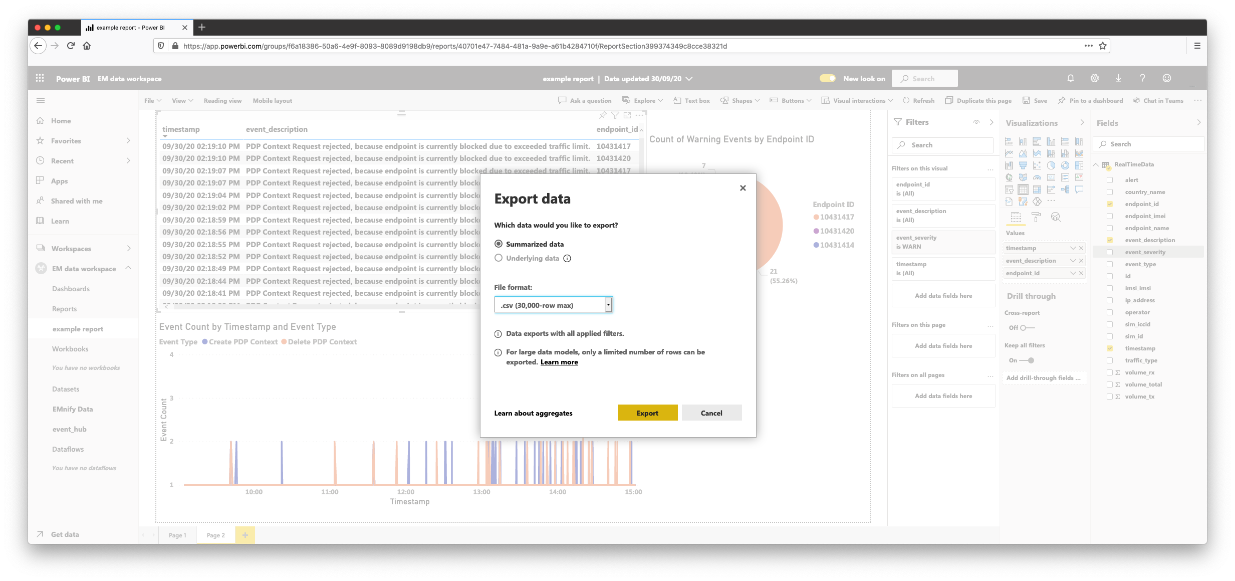
Additionally, operations teams that use Microsoft Teams as a communication channel can enjoy native sharing support by means of the Chat in Teams button in the top-right of the report. A link to the report with the current filters can be instantly shared for communication across support and operations channels: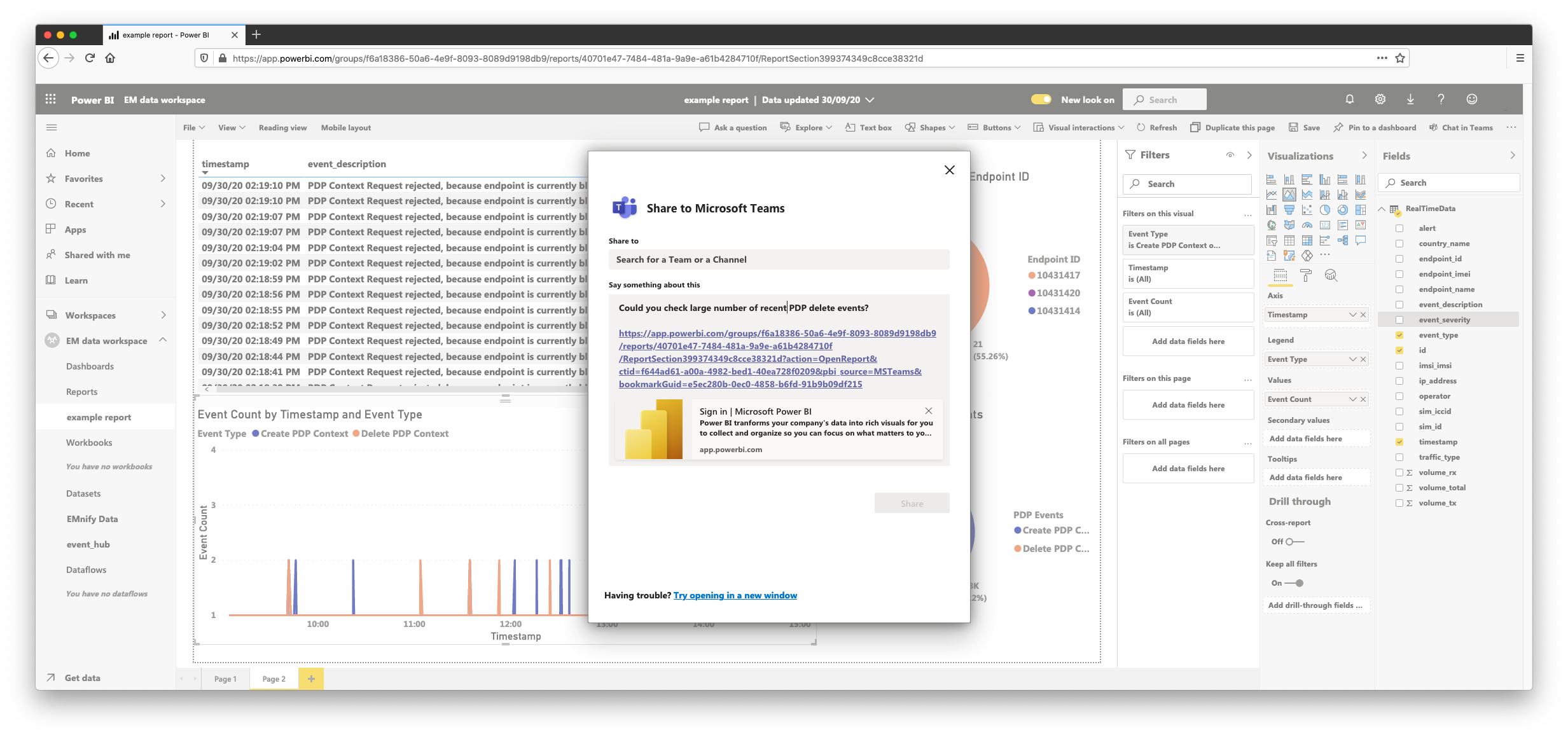
With this guide, we have covered some of the most useful metrics to graph on a report for quick insights on the connectivity information of your device fleet. Troubleshooting device connectivity is now simple to perform within Power BI by drilling down from platform warnings and generating custom reports for the devices and timeframes that matter.

emnify
The content team of emnify is specialized in all things IoT. Feel free to reach out to us if you have any question.