Stream connectivity metadata and build perspectives to monitor your devices in real-time
The EMnify DataStreamer makes connectivity data available in your Azure account for real-time insights on the consumption and state of your devices. This guide describes the steps to build a dashboard in Azure Time Series Classic - from creating a Time Series Environment, specifying a data source, and customising data visualizations which assist in troubleshooting and achieving actionable insights into your device connectivity.
This guide will cover how to build charts which display the following metrics:
- Total Data Consumption By Device last Hour
- SMS consumption last 7 days
- Data Consumption Last 7 Days
- Combining related queries to a single chart for viewing SMS & Data use per device
- Top devices with warnings in the last hour with drill-down and data export in CSV or JSON
- PDP Create and Delete activity last 7 days
Prerequisites
- A device with a cellular modem and EMnify SIM card
- An Azure Event Hub with events incoming from the EMnify platform (setup steps are detailed in the Event Hubs integration guide).
Benefits
- warnings with drill-down and exporting full event details for service teams
- allows faster triaging between device, connectivity and application issues
- view on service usage and cost per device
- directly delivered to Azure without need for managing an application server
Azure Time Series Insights Environment
Azure Time Series Insights stores your connectivity data and provides an interface to visualize it.
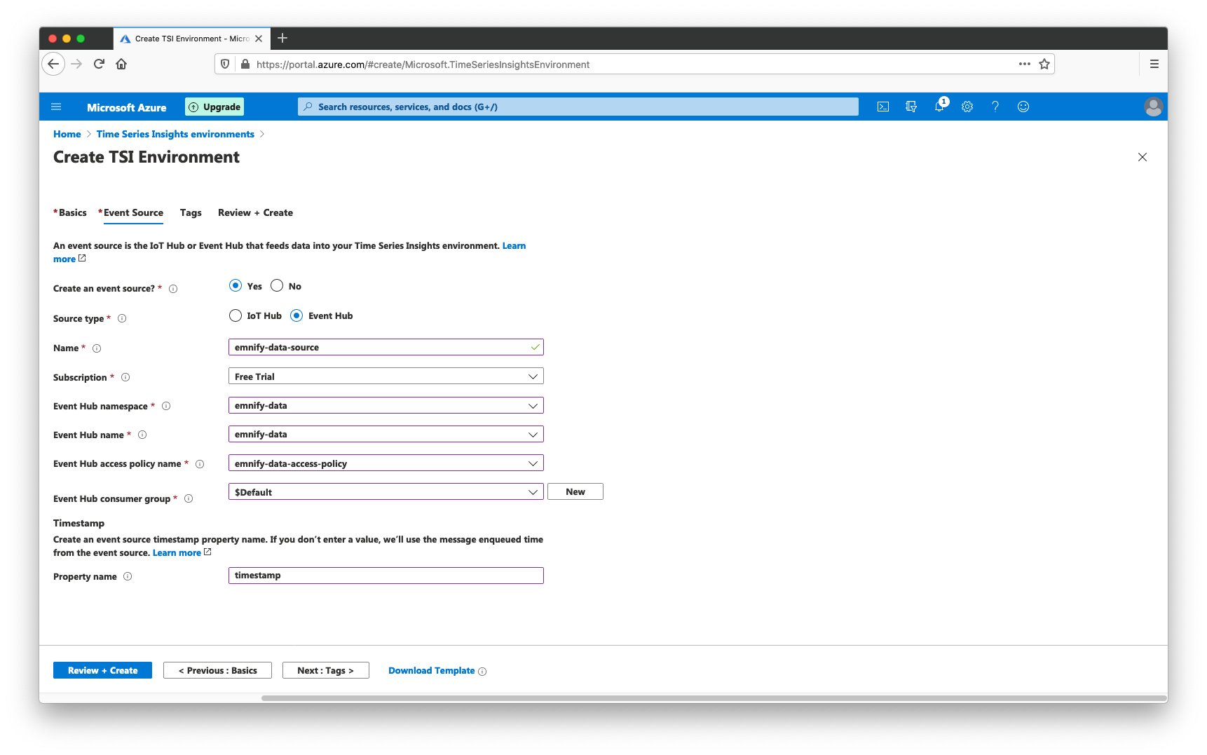
Creating a new Azure Time Series Insights environment can be done from the Home menu of the Azure portal:
- Click +Create a resource, enter Time Series and click Create
- In the basics tab, add the name emnify-data-env
- Select the resource group where the existing Event Hub is located
- Important: for the Tier, select Gen1 (S1) - the use of Gen2 tier for Time Series Classic is not supported
- For Location select one which is nearest to your geographic location, this guide uses West Europe
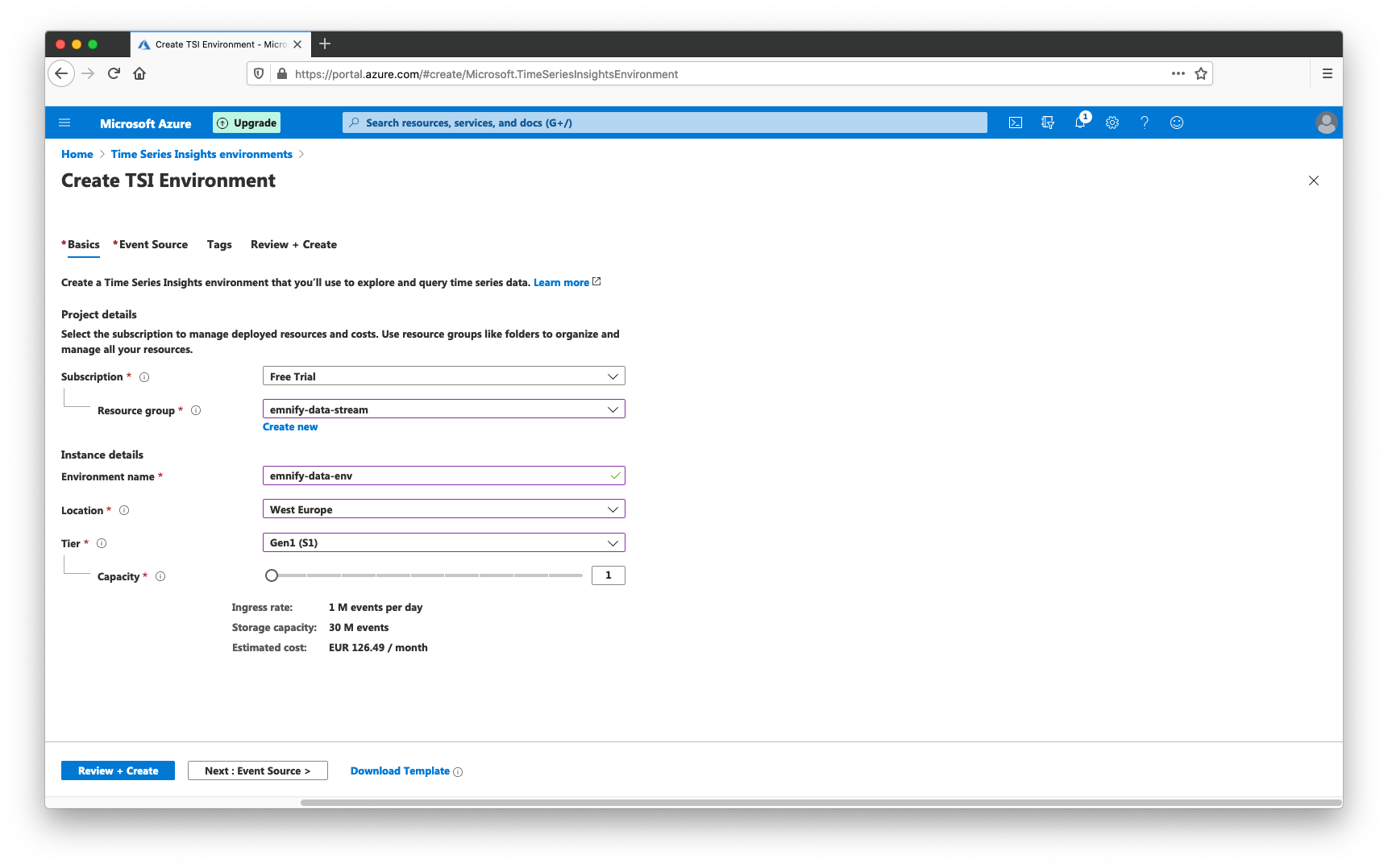
- In the Events Source section ensure Yes is checked for create an event source and select Event Hub. This will not create a new event hub, but will allow for selecting an existing resource.
- Give the event source a name, select the namespace of the existing Event Hub and choose the related access policy
- Select the $Default consumer group and set "timestamp" as the timestamp property name
 The tags section can be skipped and the resource is validated when clicking Create and will be deployed.
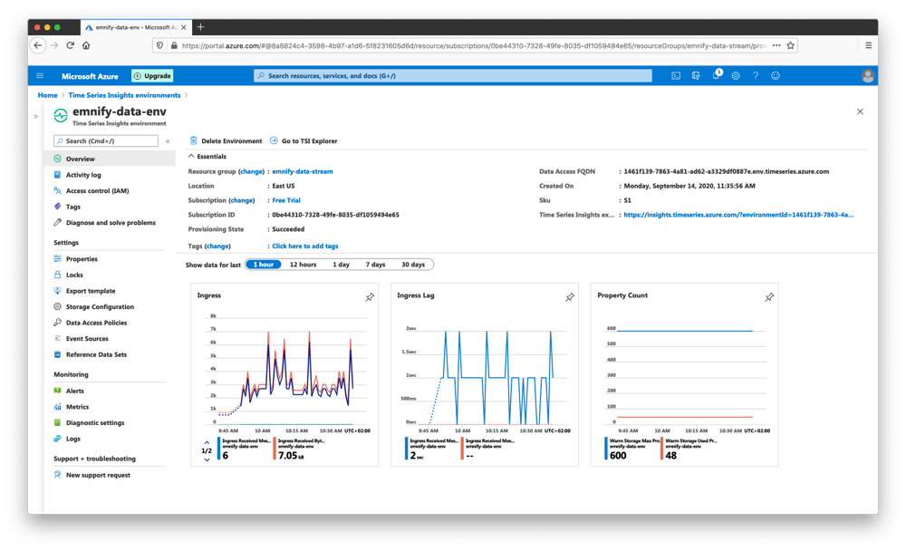
Verifying the Integration
A notification will display the location of the newly-created environment when the deployment has been successful. Click View Resource to navigate to the Overview panel of the new environment. The Ingress graph should display data points indicating that messages are being routed from the event hub to the Time Series environment.
Time Series Insights - Building Queries
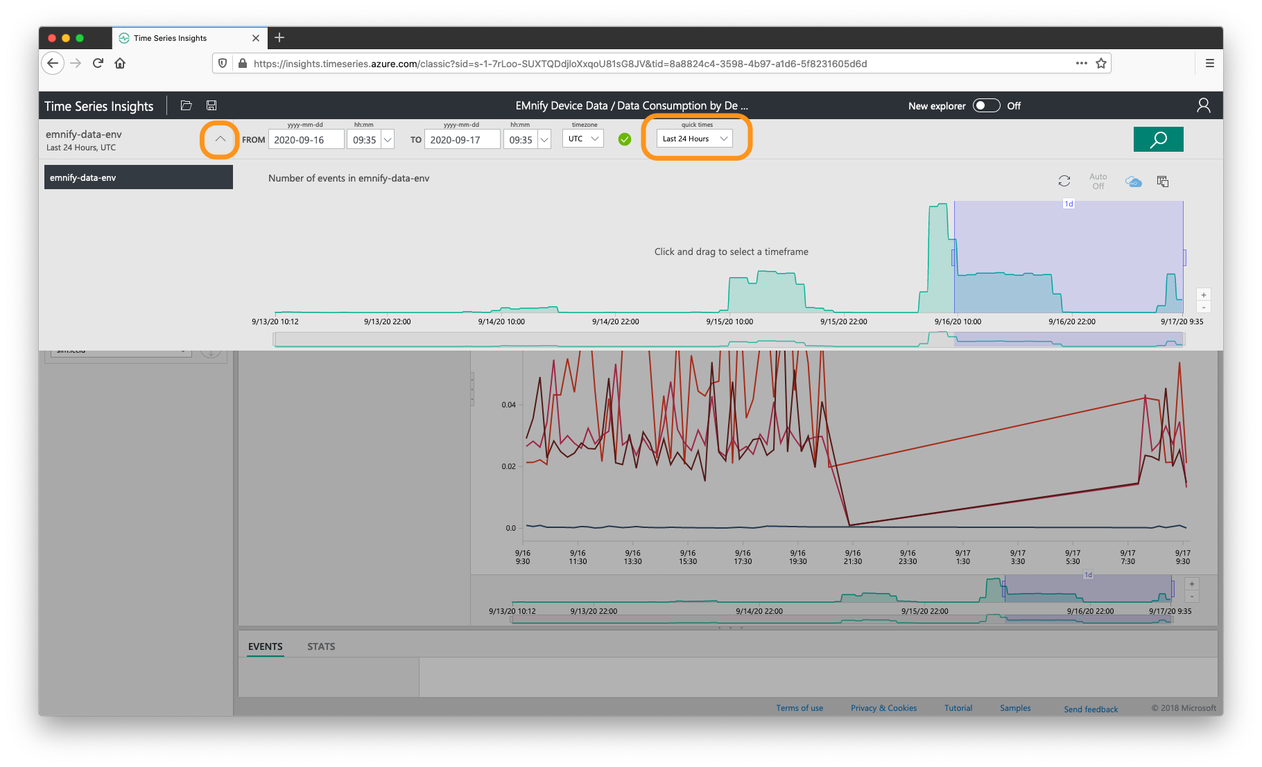
The classic explorer can be viewed by navigating to https://insights.timeseries.azure.com/classic. When first exploring this page, a timeline with incoming events is shown. This timeframe can be used to manually select the time periods to query data from using the mouse or by picking common ranges such as Last 24 hours via the Quick Time dropdown selector.
Hint: This timeframe can be accessed at any time and adjusted via the arrow symbol next to the environment name on the top-left of the page, highlighted below:
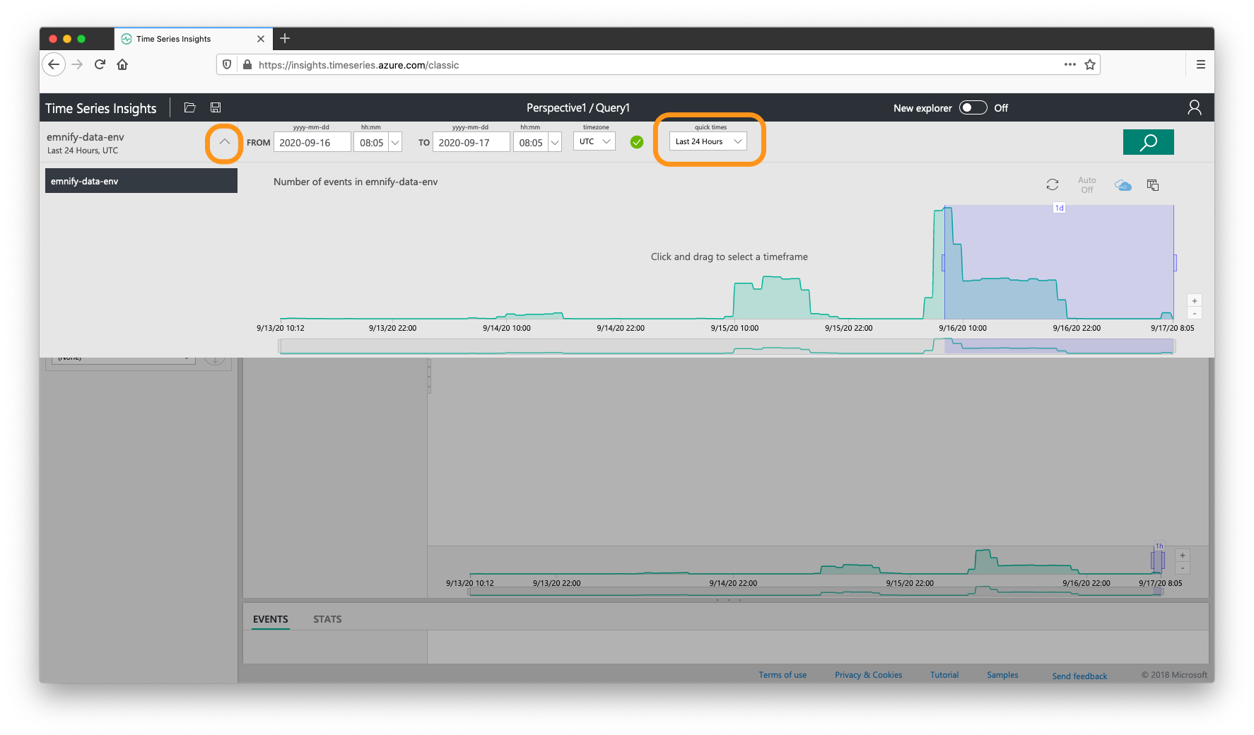
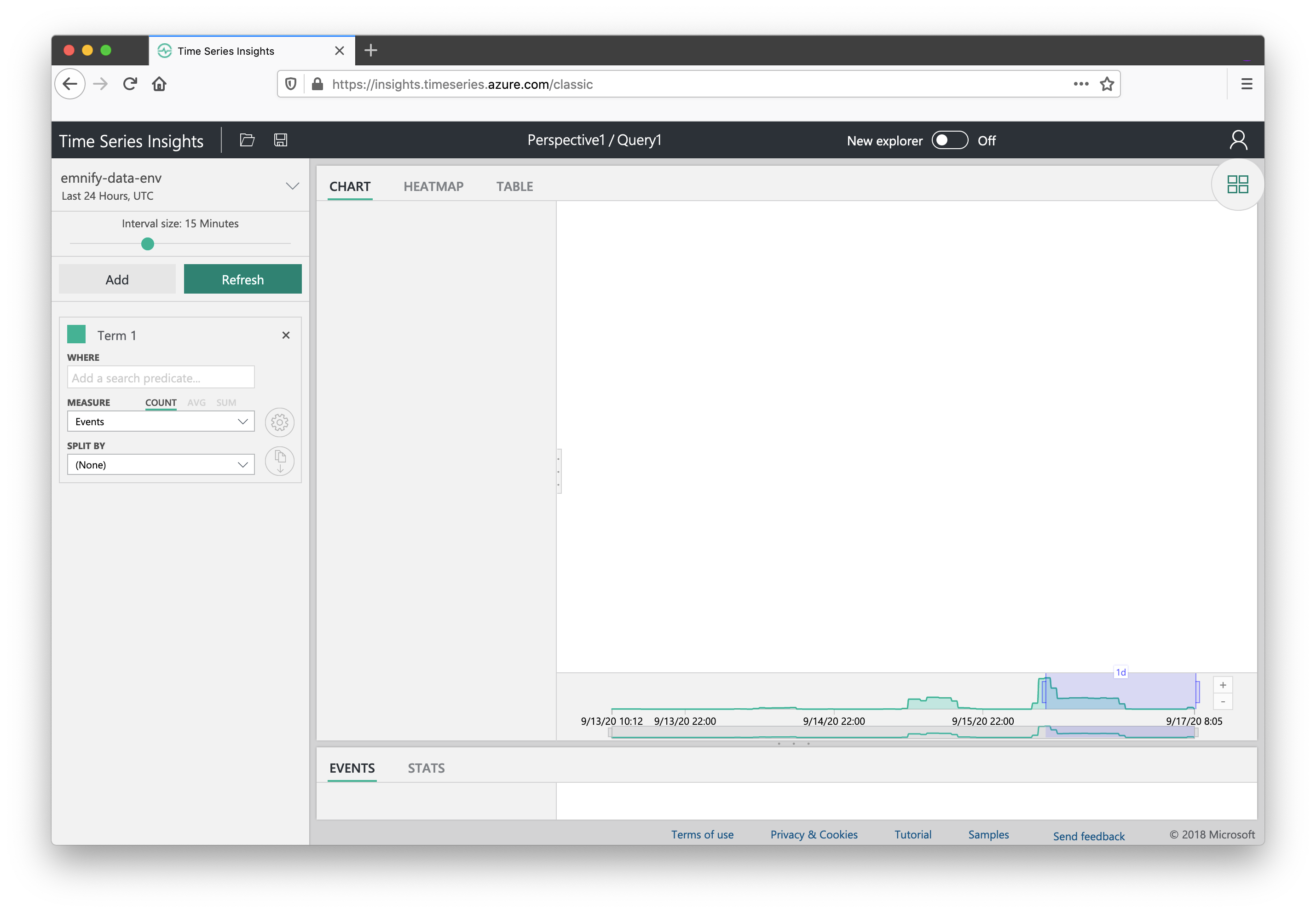
Clicking the arrow symbol next to the environment name will hide the timeline and show a query builder on the left-hand side. This panel allows for building the graphing queries with UI components for setting the interval of the graphed queries for aggregates, Where for search predicates which act as filters, measure for selecting the metric and split by for grouping results (mostly by ICCID for our use case). Each added query can be graphed separately or layered onto existing graphs and can be added to dashboards referred to as a Perspectives.
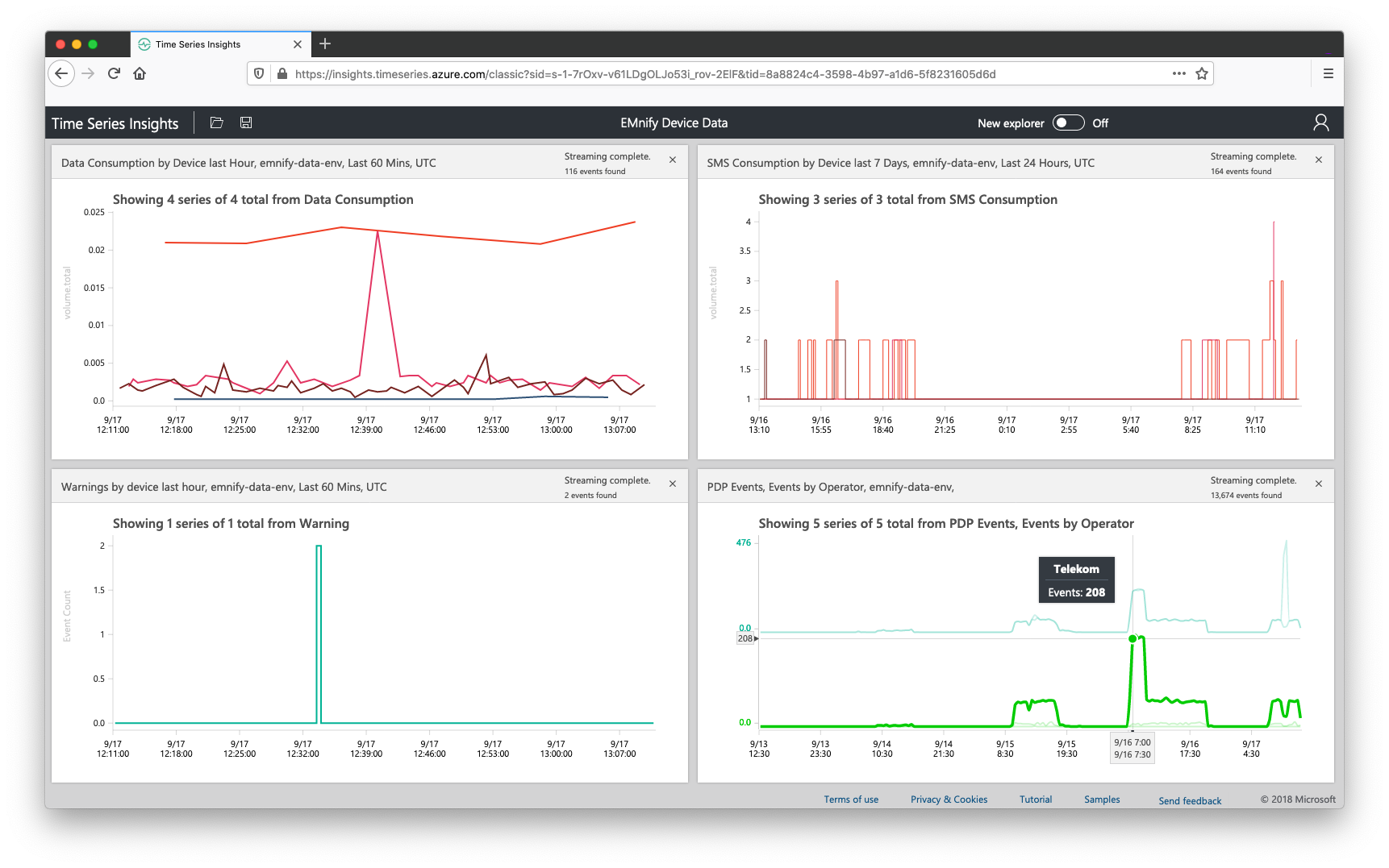
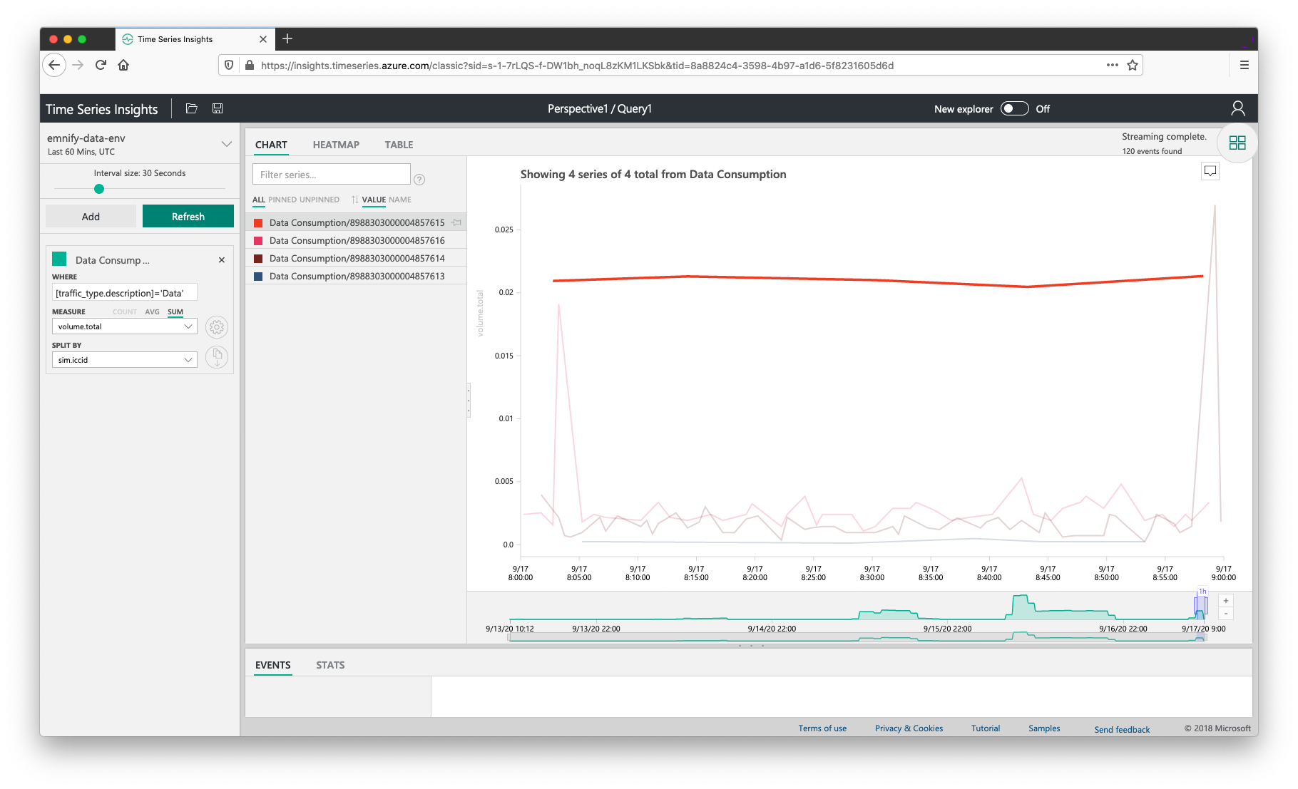
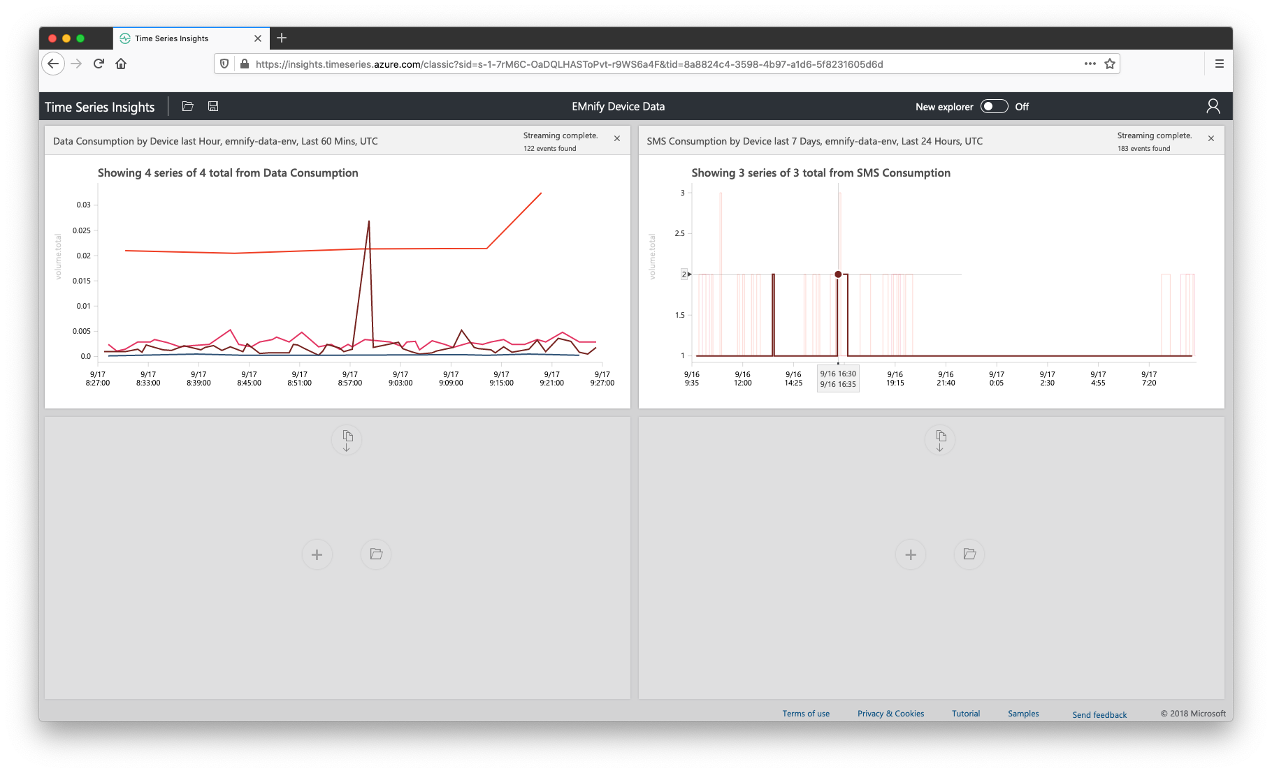
Total Data Consumption By Device last Hour
To build a graph for the total data consumption by device,
- set the timeframe to last hour and click the search icon
- In the query builder, replace the term name with Data Consumption
- For the Where value, use [traffic_type.description]='Data'
- For measure, use volume.total as a metric and set it to sum
- Select sim.iccid as a splitting parameter to show the usage by single devices
- Click the save icon in the top navigation bar and give it the name Data Consumption by Device last Hour
Under the Chart label, the graphed values can be ordered by Value and the top-consuming device can be selected from the list of devices and will be highlighted on the graph:
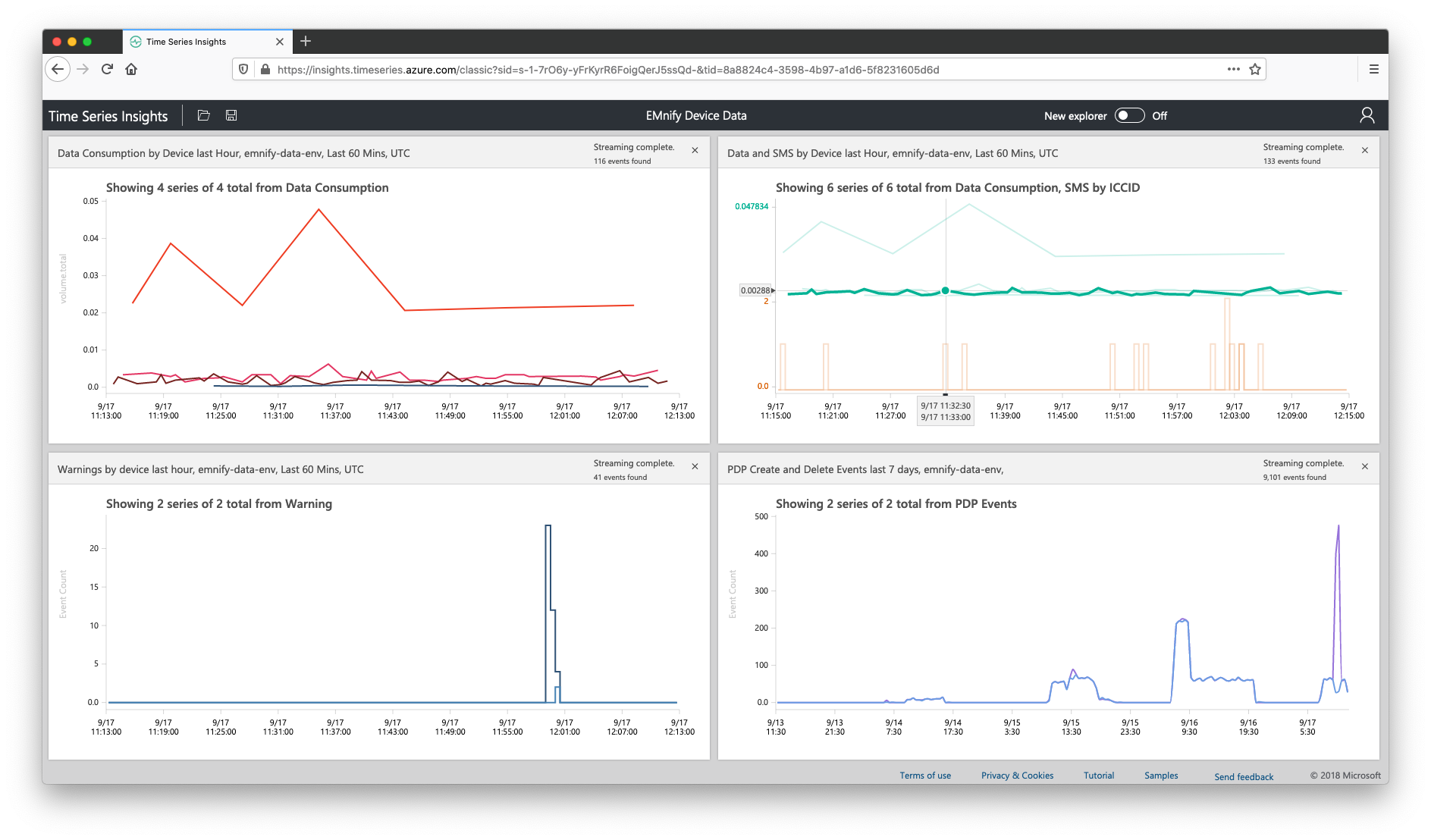
Adding the query to a Perspective
After the first query has been saved, click the icon in the top-right with four green squares to navigate to the Perspective view. This is a presentation mode which can display up to four graphs. Clicking on Perspective1 allows for giving it a name such as EMnify Device Data. Our first query will be graphed automatically and clicking on any of the values in the chart will bring you back to the query builder to edit the values or rename the chart. 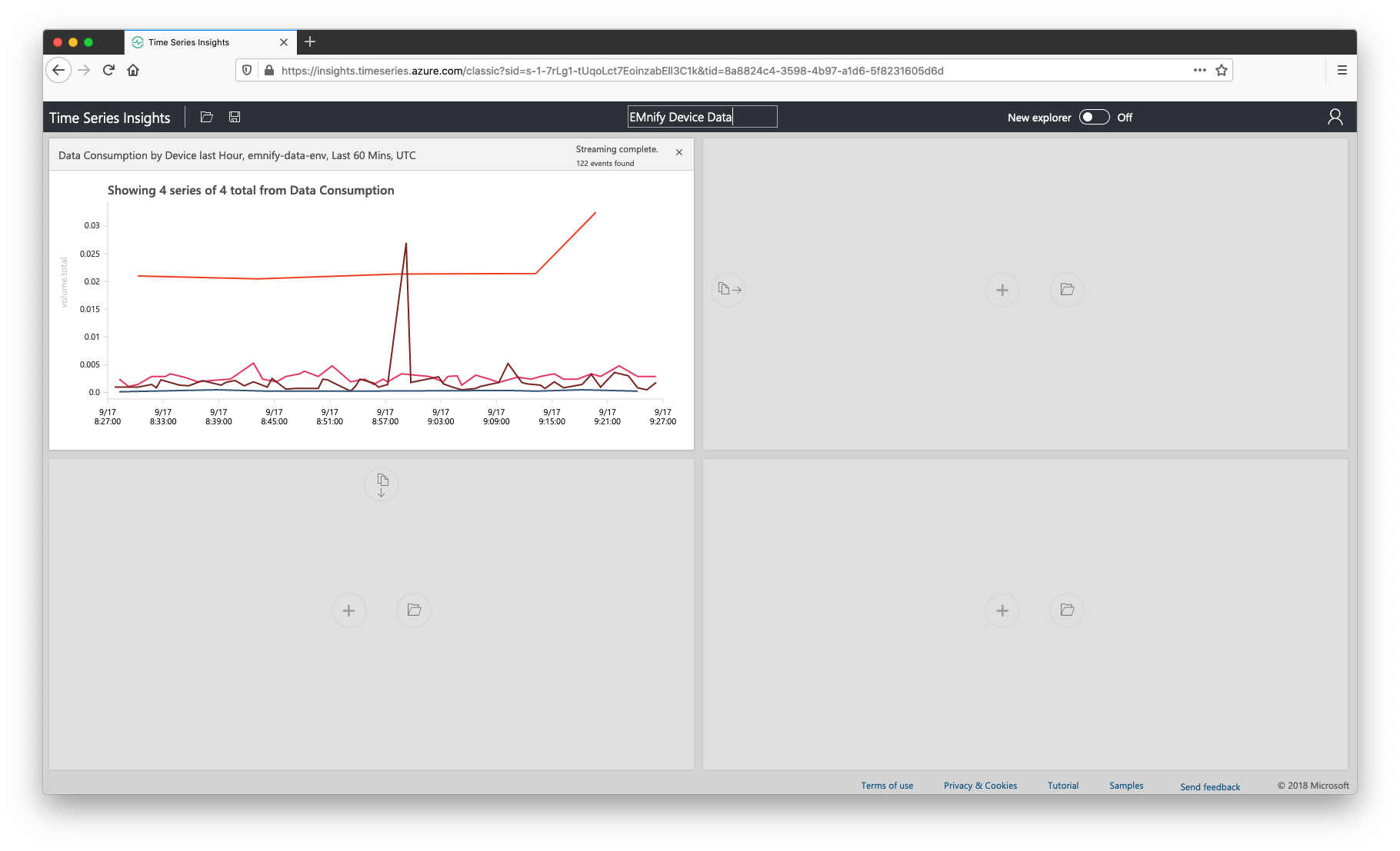
SMS consumption last 7 days
An accelerator for building additional charts is to clone queries using the copy icon in an adjacent empty graph. In the perspective view;
- Click the copy icon to the right of the data consumption chart
- Click the down arrow above the interval size and change the timeframe from last 24 hours to last 7 days
- Close the timeframe panel using the up arrow icon and set the interval size to 5 minutes
- Give the query the name SMS Consumption
- For precondition, edit the existing query so that it filters by [traffic_type.description]='SMS'
- For measure set it to sum of volume.total
- In the measure step, click the cog icon and turn on step interpolation as the units are by SMS count and this is easier to read such values
- Click the save icon and give it the name SMS Consumption by Device last 7 Days
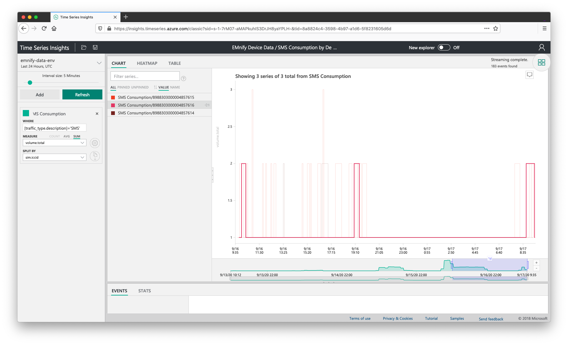
Clicking on one of the devices by ICCID from the list on the left of the chart will grey out other devices and focus on the captured metrics of that device in the chart, as displayed in the screenshot above. Clicking the icon in the top-right with four green squares and navigate to the Perspective view to view the new query on the dashboard:
Top devices with warnings last hour
For this query, we will be looking at warning events and filtering by the severity of the event which is delivered by the EMnify platform. From the perspective panel,
- Clone the data consumption by device chart in the empty panel on the lower-left by clicking on the copy icon
- Click the cloned chart to return to the query editor
- Rename the query to Warning
- Change the where condition to [event_severity.description] = 'WARN'
- For measure, set it to count Events and turn on step interpolation with the cog icon
- Click save and give it the name Warnings by device last hour
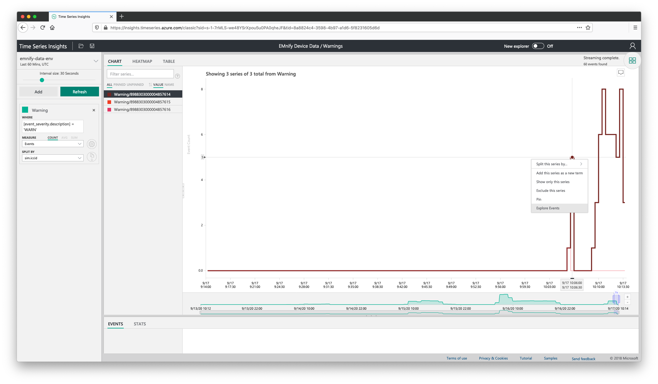
To perform a drill-down for these warnings and get meaningful information behind their causes:
- Right-click on a value in the chart and select Explore Events
- Select the Events tab and drag the bottom panel up to reveal the raw JSON events described on the chart
- Columns can be displayed or hidden by clicking on the header names in the left panel, the most useful columns for troubleshooting these warnings are:
- event_type.description
- description
- timestamp
- endpoint.name or sim.iccid
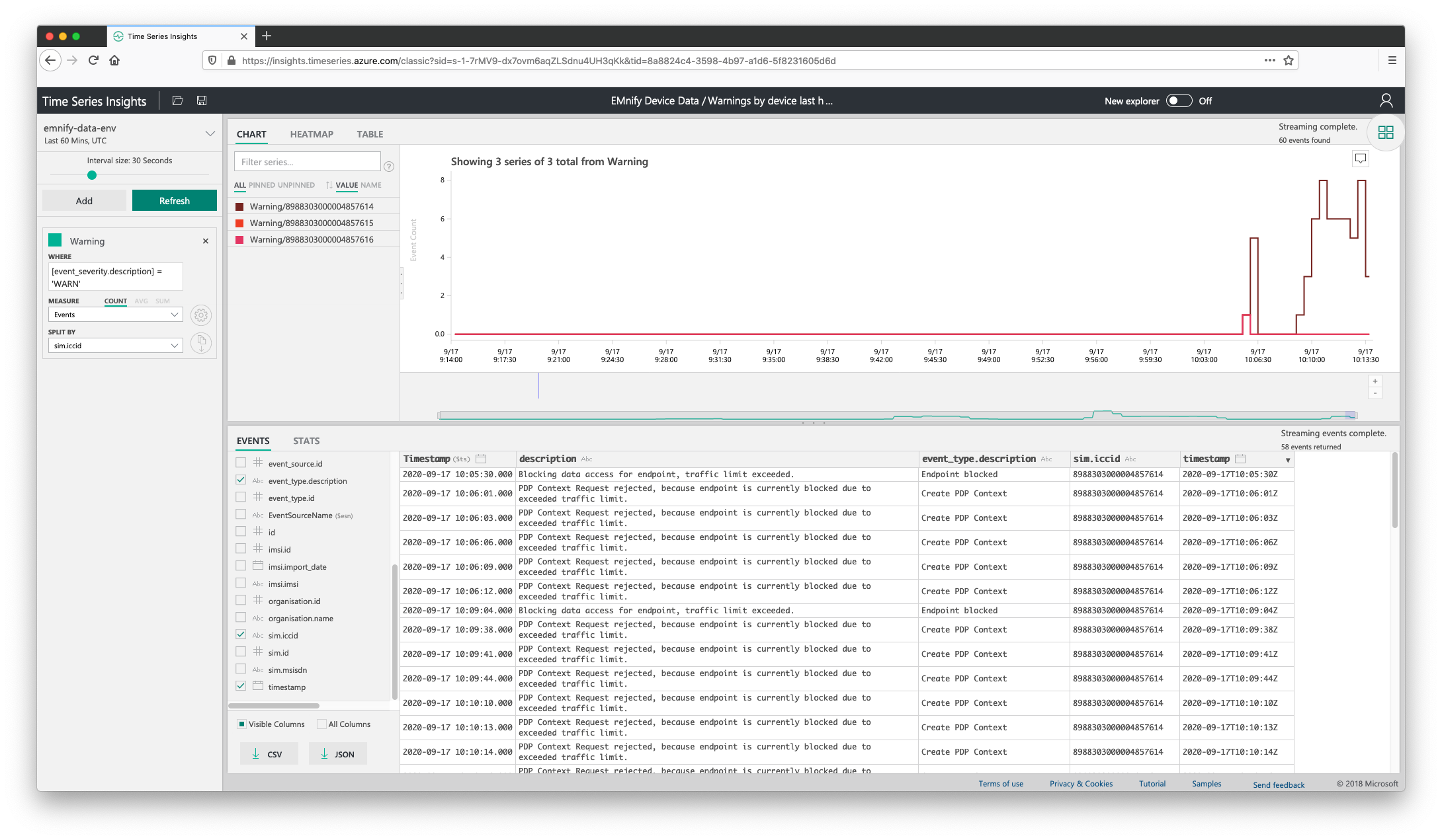
This information can then be used to cross-reference against application errors in cases where connectivity information can assist with overall system troubleshooting. The visible columns or all columns can then be exported as CSV or as JSON to have a report of device errors last 60 minutes for easily sharing between operations teams.
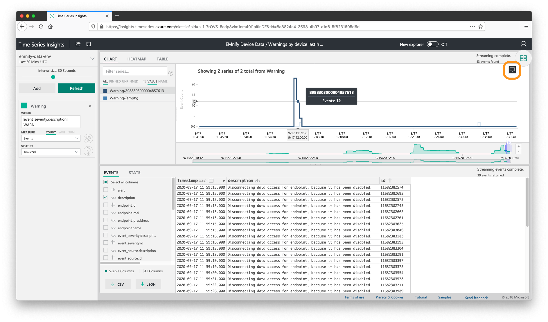
Hint: tooltips for each graph can be enabled by clicking on the tab icon on the top-right of the chart. This enables for viewing endpoint names or ICCID on mouse hover. Enabling this feature is highlighted in the screenshot below:
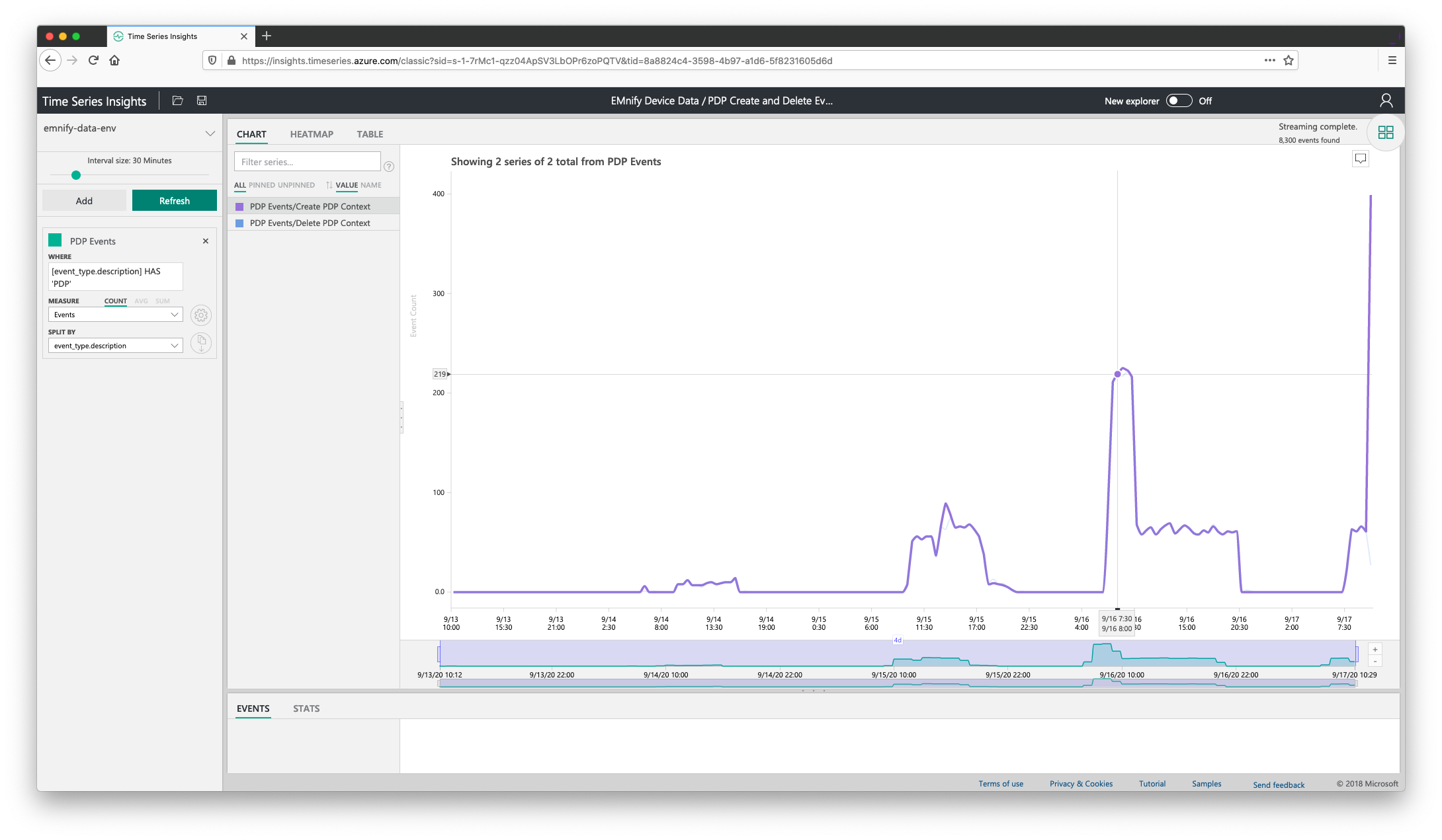
PDP Create and Delete Events last 7 days
From the perspective view,
- Clone the SMS Consumption by Device last 7 Days chart
- Click on the chart to enter the query builder
- For the where predicate, use [event_type.description] HAS 'PDP'
- For the measure rule, set it to count Events
- And set the split by rule to event_type.description
Combining Queries - SMS and Usage Data by Device
To optimize the available space of the perspectives view and to allow for exploring multiple queries per chart, related metrics can be added to a single chart in lanes or stacked on top of each other. One example that helps in our use case is to combine the SMS and Usage data by device onto a single chart. From the perspective view,
- Click the graph SMS consumption last 7 days to open it in the query editor
- Click the Clone this item icon beside the split by parameter so that we have two queries
- Change the where precondition on one of the queries to [traffic_type.description]='Data' and rename the query to Data Consumption
- Click the Save icon and give it a name Data and SMS per device last 7 days
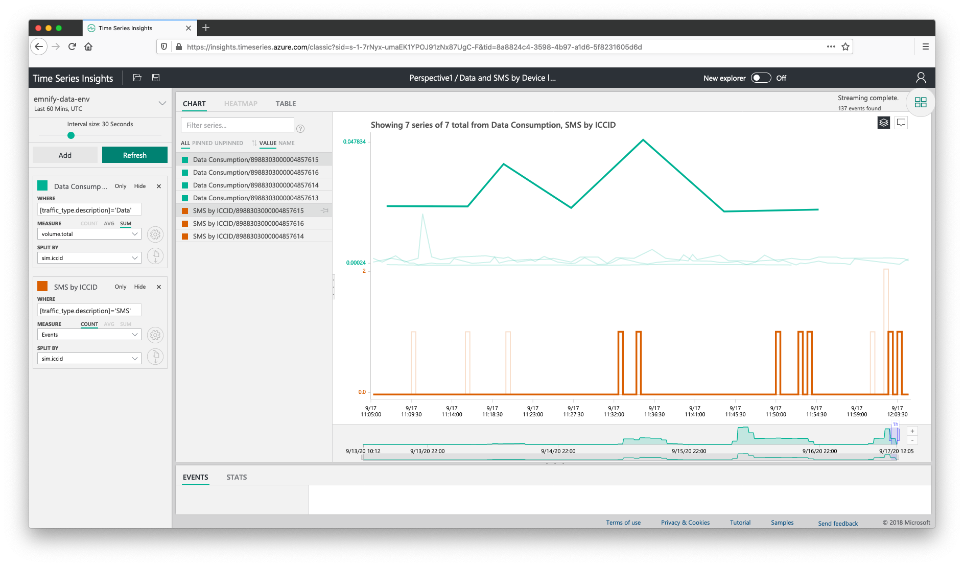
The perspective view now has both the SMS and Usage data displayed by ICCID. When hovering over one of the lines in the graph, the SMS and Usage data for that device will be highlighted.
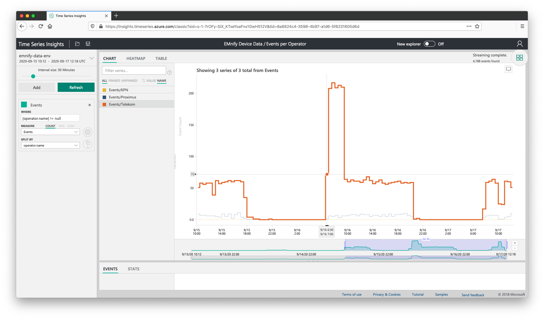
Count of events per Operator
The following query will allow for counting the number of total events per operator including usage data and SMS. To create this query,
- From the query builder, click Add
- For the where predicate, choose [operator.name] != null
- Measure the count of Events and enable step interpolation
- For split by select the operator.name
With this guide, we have covered some of the most useful metrics to graph on a dashboard for quick insights on the connectivity information of your device fleet. Troubleshooting device connectivity is now simple to perform within Time Series by drilling down from platform warnings and generating custom reports for the devices and timeframes that matter.

emnify
The content team of emnify is specialized in all things IoT. Feel free to reach out to us if you have any question.