
Stream connectivity metadata and build dashboards to monitor your devices in real-time
Before each device is able to send data to an application server, it needs to communicate with the mobile network to ensure that the data is allowed to be sent over the network. This communication happens through signaling events which are usually hidden to the application. The EMnify DataStreamer makes this connectivity metadata and device data usage available in real-time in your Datadog account for detailed insights on the consumption and state of your devices.
The following guide will cover the steps necessary to create a DataStream integration from the EMnify platform to quickly and securely deliver usage records to Datadog. For this example integration, we will build the following features:
- Top devices with highest data consumption
- Top devices with highest change in data usage compared to previous hour / day
- Graph total data usage per device on a single graph
- Configure custom monitoring with email alerts and anomaly detection
- Automatically generate a dashboard with a graph per device showing data usage over time
- Add custom links to your graphs to display devices of interest in the EMnify portal
Prerequisites
- A device with a cellular modem and EMnify SIM card
- A Datadog account in the US Region (it is not possible to migrate data between DataDog regions)
Benefits
- data consumption integrated into operational dashboards for service teams
- allows faster triaging between device, connectivity and application issues
- view on service usage and cost per device
- directly delivered to Datadog without need for managing an application server
Integration steps
1. In your Datadog account, navigate to Integrations → APIs from the left menu
2. Create a new Application Key and give it a name
3. Note the location of the API Key and Application Key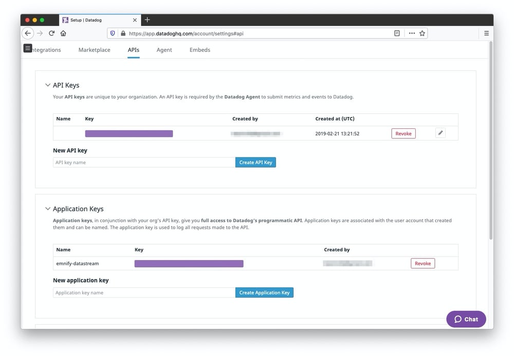
4. Log in to the EMnify portal and navigate to the Integrations page to create, inspect and manage Data Streams:
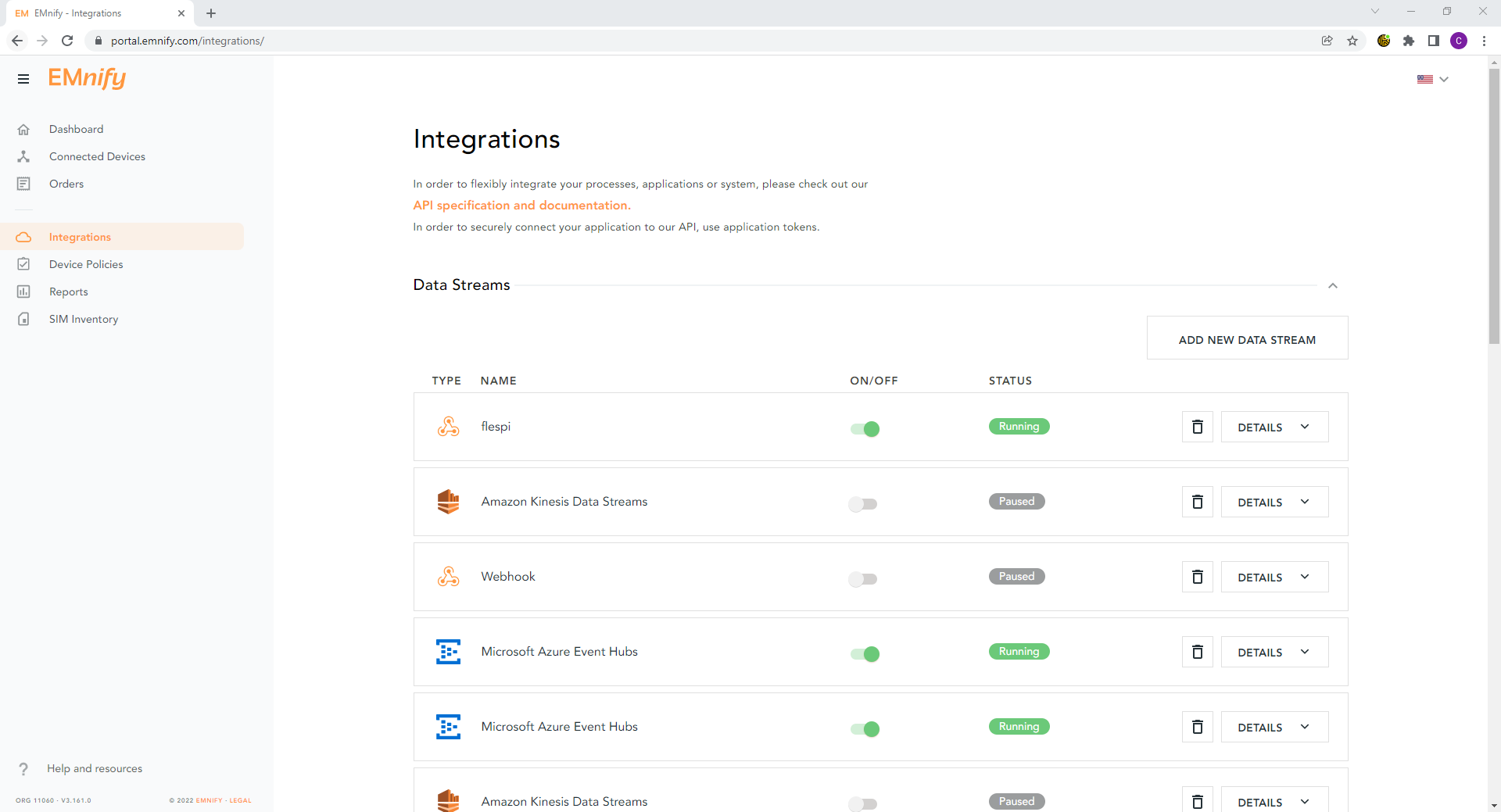 5. Click Add New Data Stream and under DataDog click ADD
- Select Stream usage data as the stream type
- Enter the API Key and Application Key from step 3
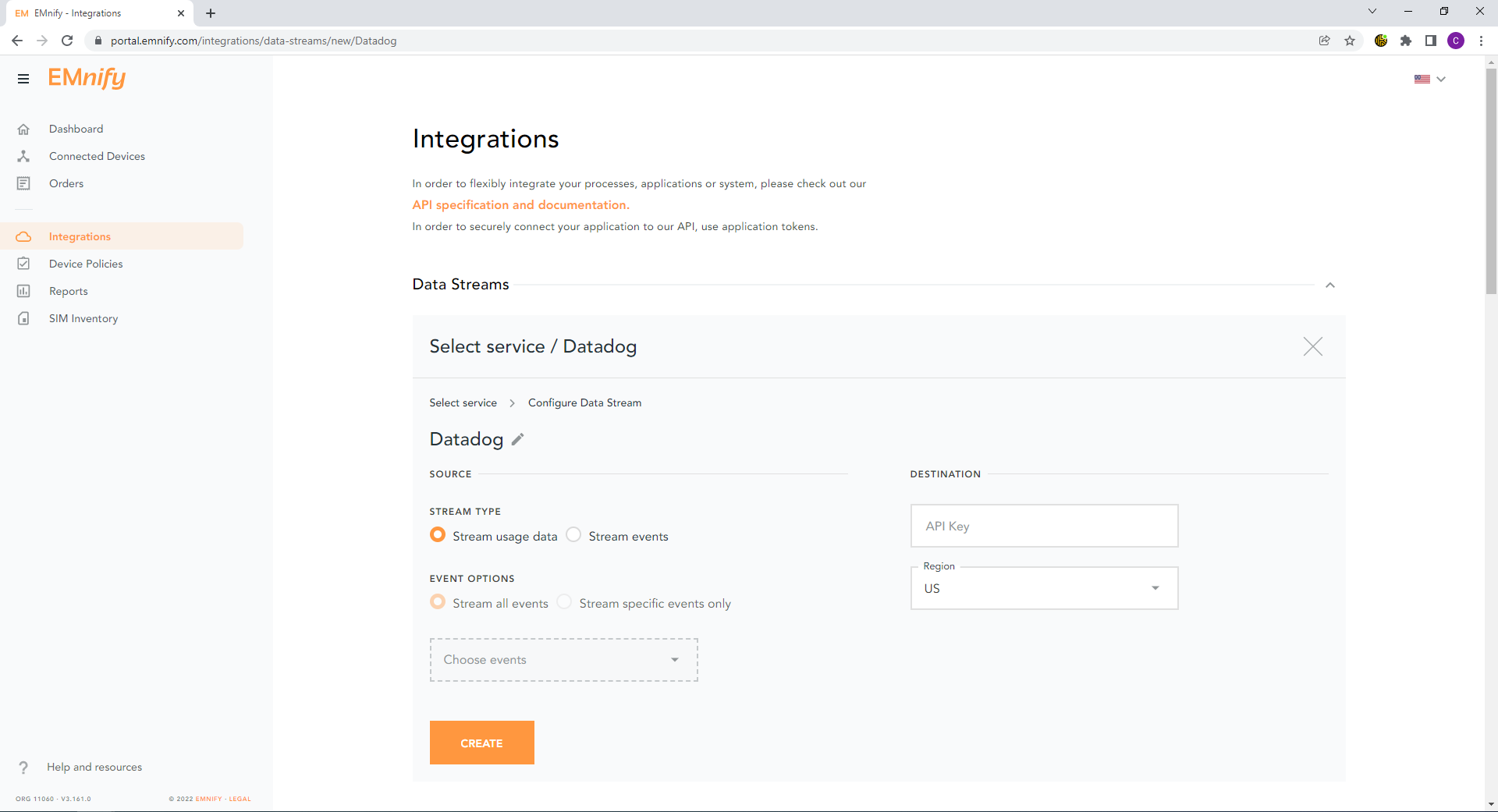
Newly-created data streams are immediately active and should show a green Running status indicating a 200 HTTP response code when correctly configured.
If the configuration is invalid, a warning message will be displayed indicating incorrect configuration.
Verifying the integration
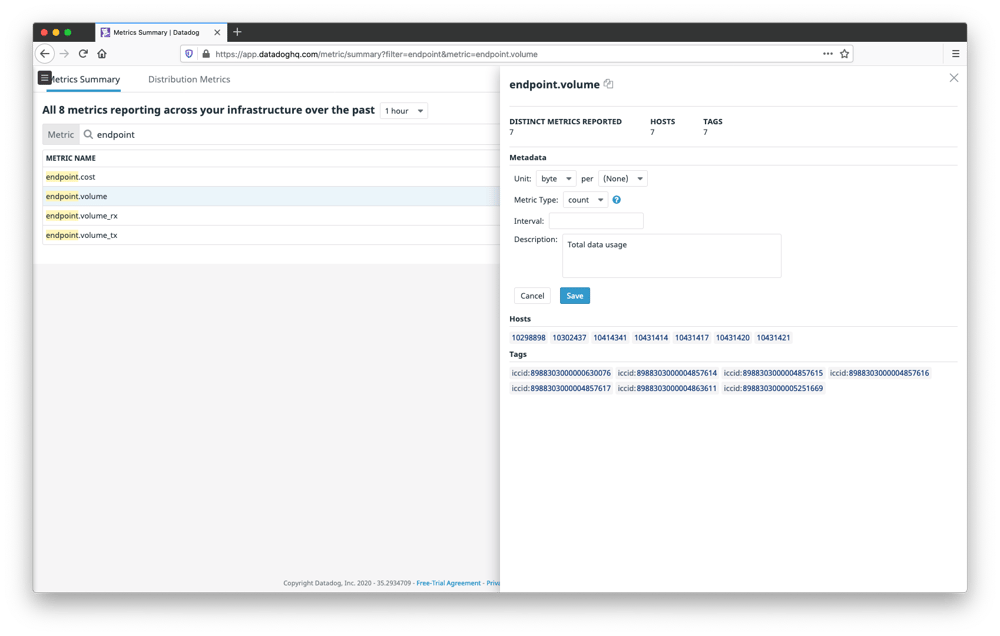
Navigate to Metrics -> Summary to configure the units of data consumed to be reported as bytes and count as the metric type. This can be configured for
- endpoint.volume - total data consumption by device
- endpoint.volume_rx - data received by device
- endpoint.volume_tx - data transmitted by device
Graph data consumption per device (for smaller fleets)
To generate a dashboard with graphs for each device in your fleet, navigate to Metrics -> Explorer
- For the Graph input, select endpoint.volume over 'Everything'
- In One graph per select ICCID
- On each graph aggregate with the Sum of reported values
- An optional prefix can be added to all graphs and a max limit of graphs can be specified
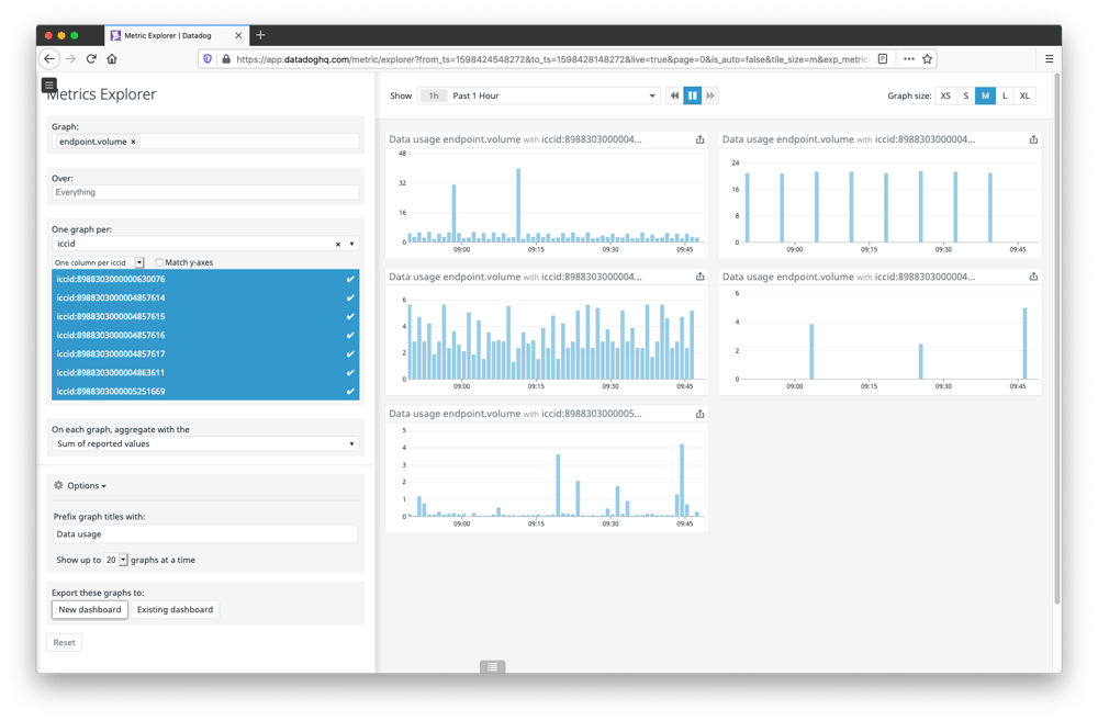
- Click New dashboard to export all graphs to a new dashboard
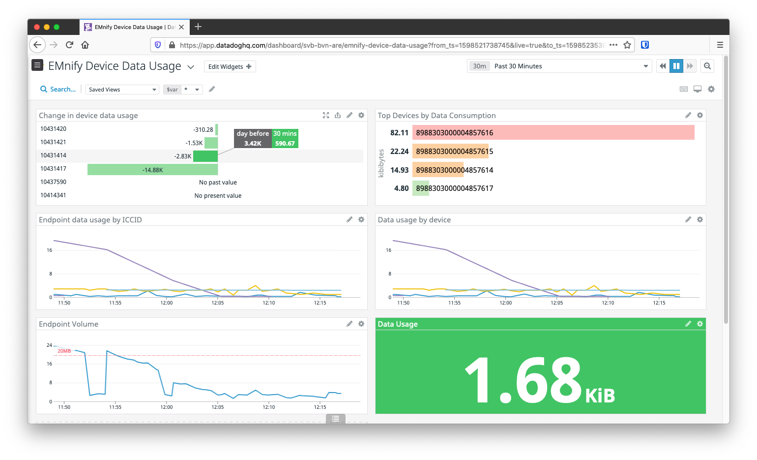
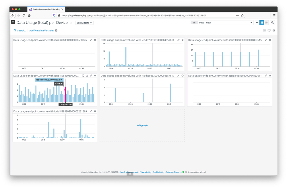 The dashboard will be populated with a graph per device and on mouse hover will display the value during that event time while highlighting the corresponding time period in other device graphs for quick comparison. In the dashboard above we can get an immediate impression of which devices are most active, including those which have not been sending data in the last hour.
Building new dashboards
The next section details how to create new graphs for a dashboard which highlight specific metrics that are important for our use case.
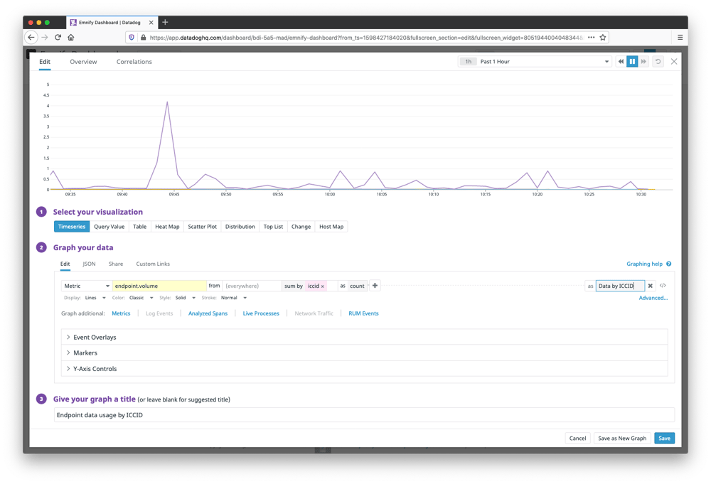
- Navigate to Dashboards -> New Dashboard
- Give the dashboard a name and select New Timeboard
- On the new dashboard, click Add graph and drag a Timeseries graph to the editing area
- In the graph editor select the metric endpoint.volume from everywhere and sum by ICCID as count
- On the right of the metric query, an alias of Data by ICCID will make the graph readable
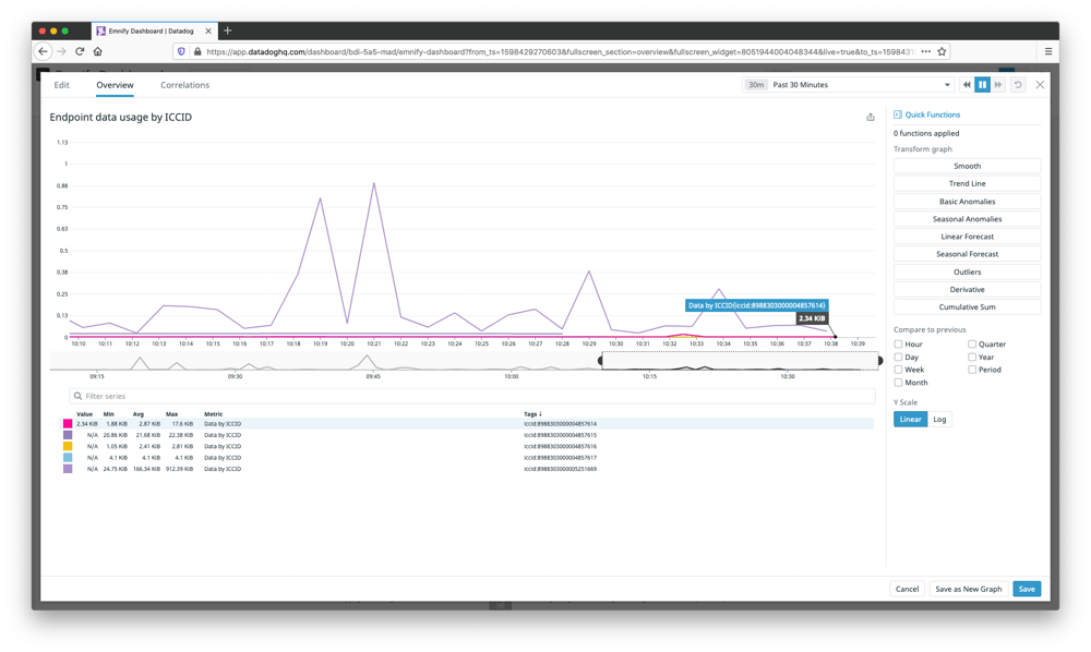
- Add a title Endpoint data usage by ICCID to the graph and click Create
The graph is now visible on the dashboard and can be interacted with. Clicking on the expand icon will open the widget in full-screen and allows for an overview of the displayed metrics with a table showing a breakdown with average, minimum and maximum reported values.
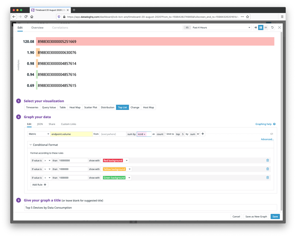
Top Devices by Data Consumption
Showing the top devices by data usage is a simple and effective way to identify devices which are using more data than expected. This can be especially helpful for troubleshooting misconfigured devices which may consume a large amount of data.
- On the dashboard, click Add graph and select Top List
- Select the metric endpoint.volume from everywhere and sum by ICCID
- Optional Conditional Formatting will allow for colorizing the graphed values based on amount of bytes
- Give the graph a title and click Save
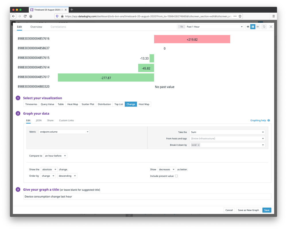
Graph changes in data usage compared to previous hour/day
Showing the change in data usage can act as an additional gauge in unexpected changes relating to data consumption. To measure changes in data usage in the past hour:
- On the dashboard, click Add graph and select Change
- Select the metric endpoint.volume, take the sum and select break down by ICCID
- Compare to an hour before to create a graph that will highlight changes relative to the previous hour. If devices follow daily operational patterns, comparing to previous day will display the usage compared to the same time range of the previous day.
- Give the graph a name and select Save
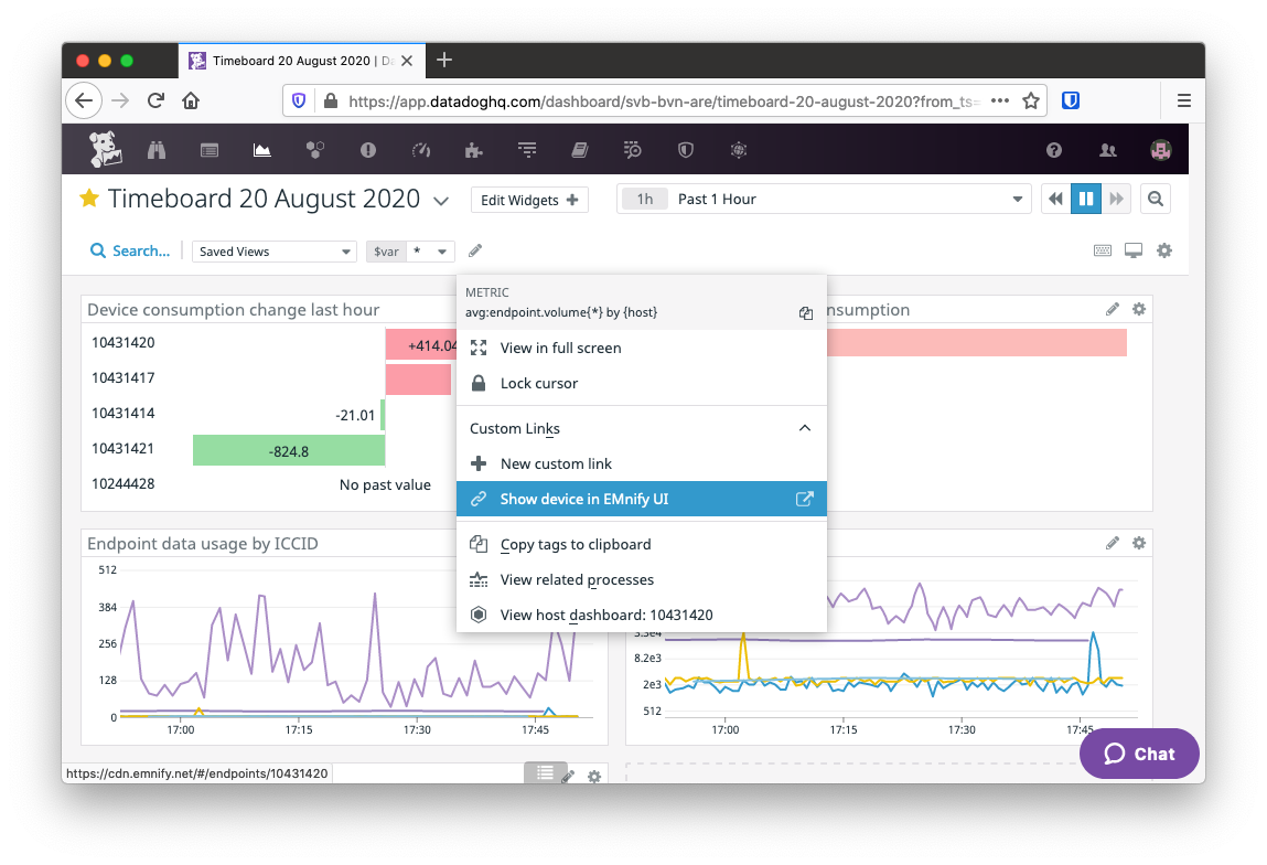
- For additional assistance in drilling down and troubleshooting via this graph, click Custom Links
- Set the URL value to
https://cdn.emnify.net/#/endpoints/{{host.value}} - Set the label "Show device in EMnify UI"
Clicking on one of the devices in this chart will now contain a contextual menu item for displaying the device in the EMnify UI to cross-reference device configuration.
Filtering multiple graphs by ICCID
Using the $var value in graphs allows for specifying the endpoint id (host) or the ICCID as a filter value for multiple graphs. To enable filtering across a dashboard in this way:
- Edit the graph Endpoint data usage by ICCID
- Change the metric from to $var and click Save
- A dropdown menu on the top-left of the dashboard allows for selecting the value of $var across all graphs.
The graph that previously displayed metrics for all endpoints now shows only the selected ICCID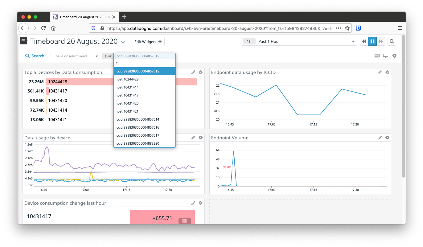
Configuring Monitors
As connectivity data is now arriving in real-time, the next useful steps that can be configured is alerting via the Monitoring features of Datadog.
- Navigate to Monitoring -> New Monitor and set the time period to 4 hours
- Select endpoint.volume from everywhere and sum as count
- Set alert threshold to the value in bytes, 20000000 for 20MB in this case
- Set an optional warning threshold, this example uses 19000000 for 19MB
- Add an optional user or groups of users to be notified by email if the alert is triggered and click Save
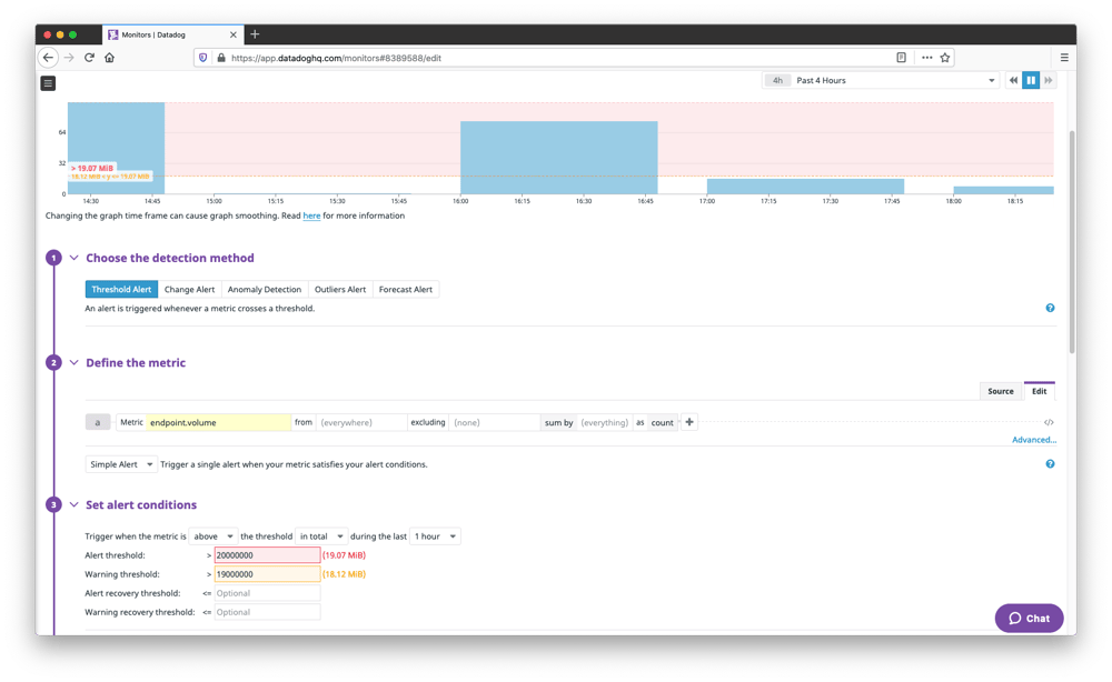
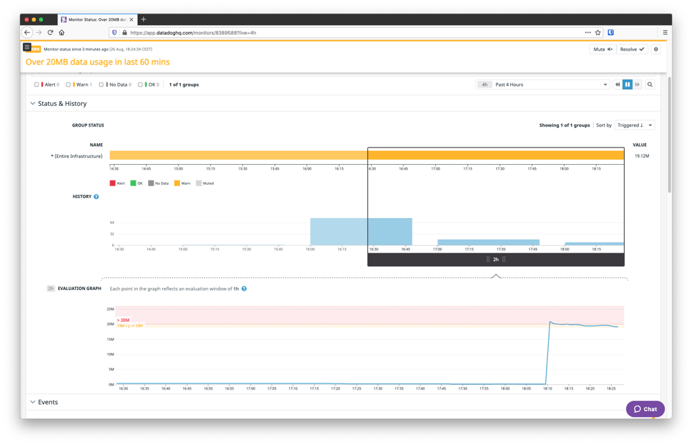
A monitor with alerting has been created and can be explored in the Manage Monitors tab with a detailed history of when alerts were triggered relative to the activity of your device fleet. The new monitor shows that we are above our warning threshold and the evaluation graph shows progression of the alert between warn states:
The monitors configuration has an effective detection method for our use case called Anomaly detection. This is especially useful for identifying unusual large spikes of data usage. Using the default configuration, this monitor does not accept threshold values but will measure the average minimum and maximum values of data usage of the device fleet and highlight sudden peaks: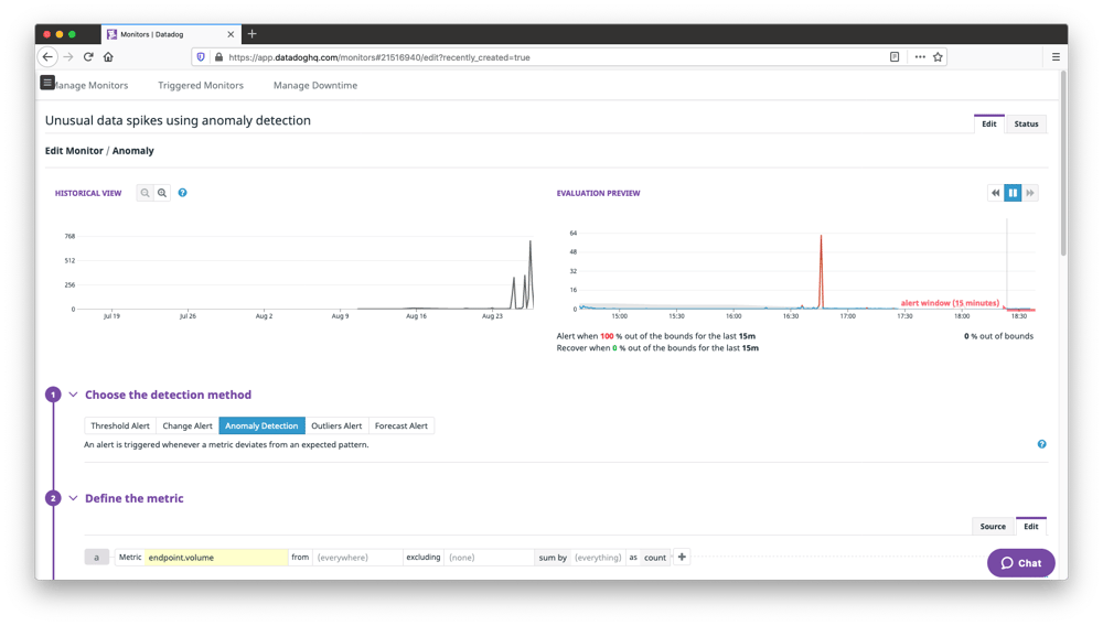
When configuring a monitor, the Notify your team section allows for adding Datadog users or teams to a list of recipients. The default channel for alert notifications is to use the email address associated with their Datadog account.
Next Steps
In this guide, we have learned how to create simple dashboards which provide actionable insights into the data consumption of your devices. A useful integration that can improve communication of these insights and alerts with other teams such as operations or support is to add a Slack integration. This is quickly and easily configured within Slack by creating a webhook URL in your workspace and configuring Datadog to use this channel for delivering notifications in individual monitors instead of email. The Datadog documentation describes the steps necessary to enable this functionality to get graphs and alerts delivered to your private or public Slack channels.

emnify
The content team of emnify is specialized in all things IoT. Feel free to reach out to us if you have any question.